When first arrive to the Square Enix offices in London I felt like in wonderland. As a gamer, getting to work in the gaming industry it’s been a real pleasure and doing it in a project like this one gave me a good playground to create and design with ease.
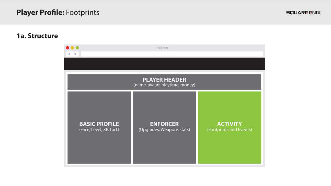
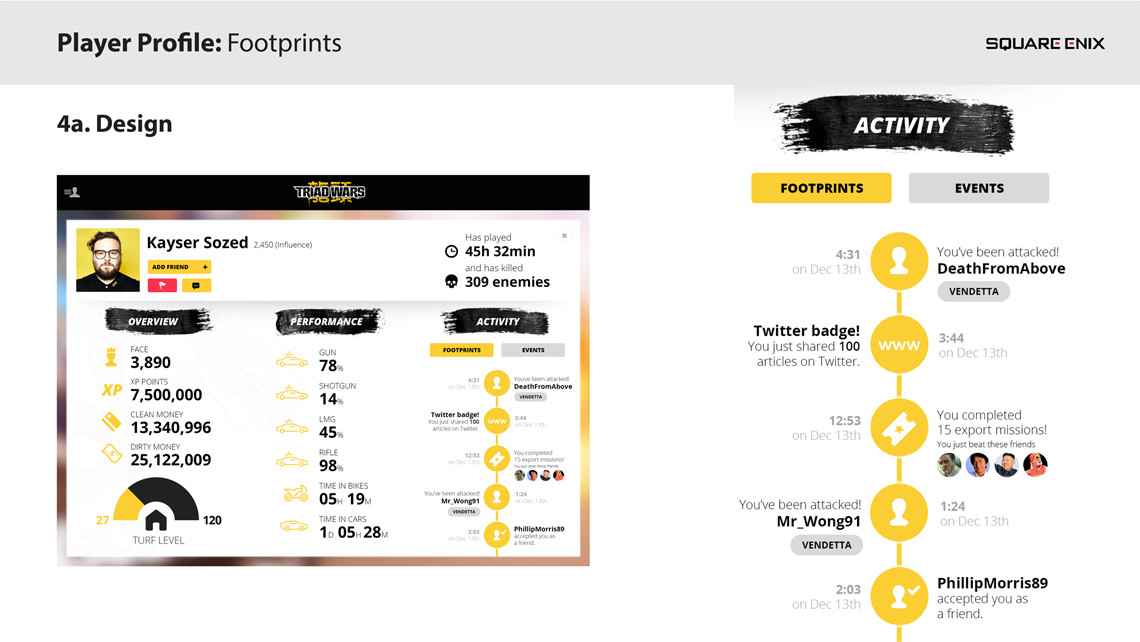
As I arrived to the project my first task was to redesign the whole site, starting by the player’s profile page. This page would represent the player’s progress through the game displaying different sets of data that are read directly from the game.
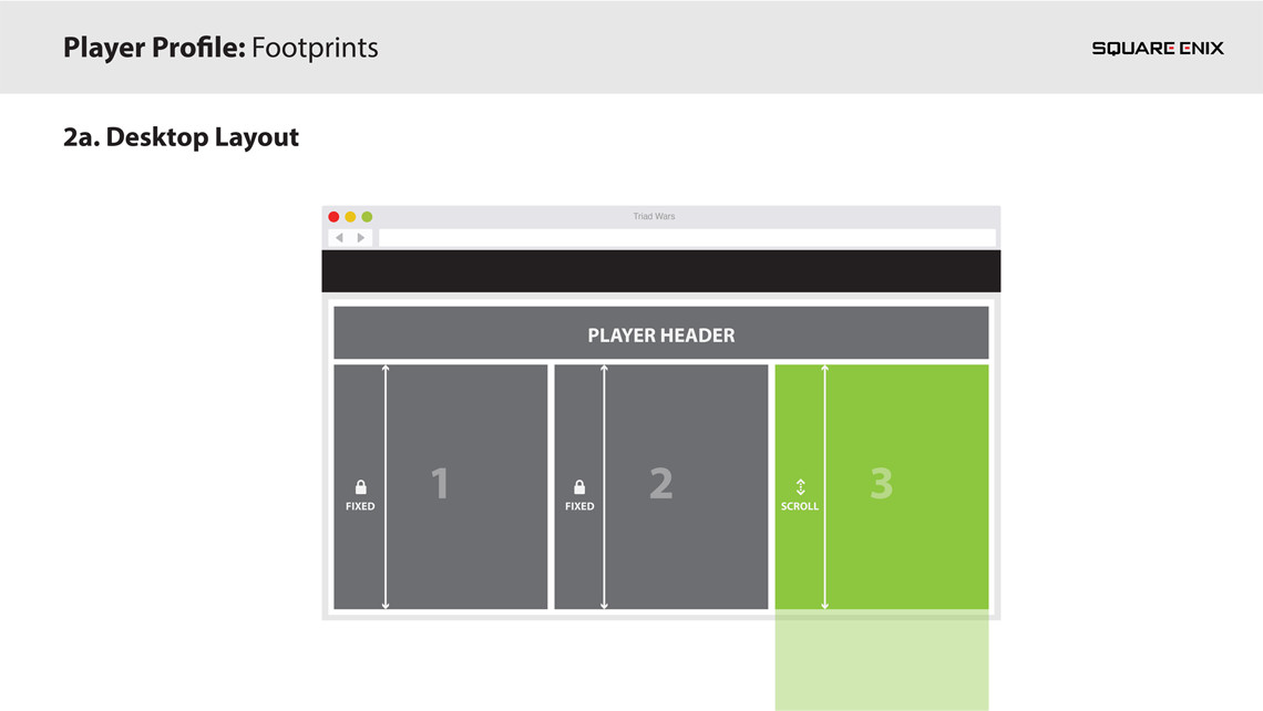
3 information sources:
Basic profile data
Enforcer status
Player activity
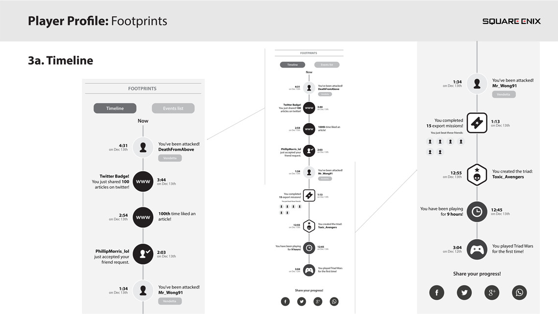
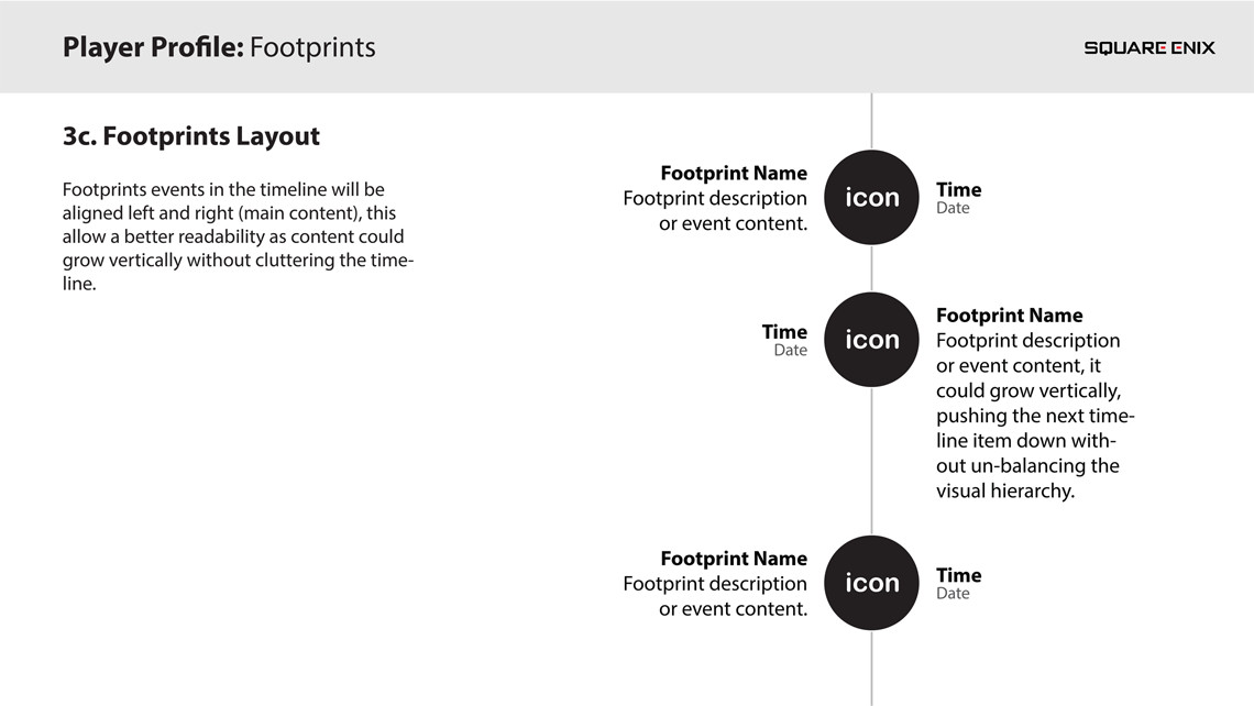
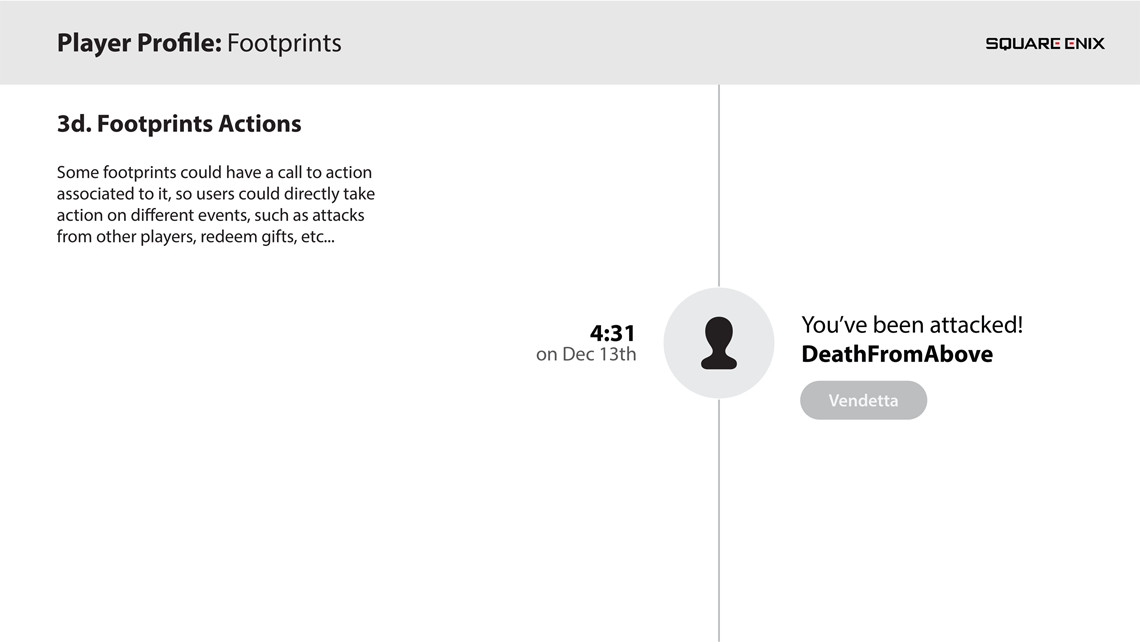
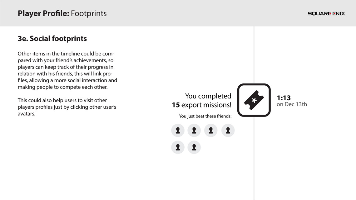
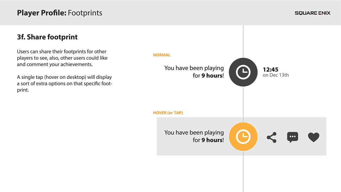
Defining footprints
Every player performs different actions through the game, these actions leave a milestone in every player’s profile. The different milestones (or footprints as we called them) may come from doing some specific missions, achieving some goals, improving your character or socialising with other players (or attacking them!).
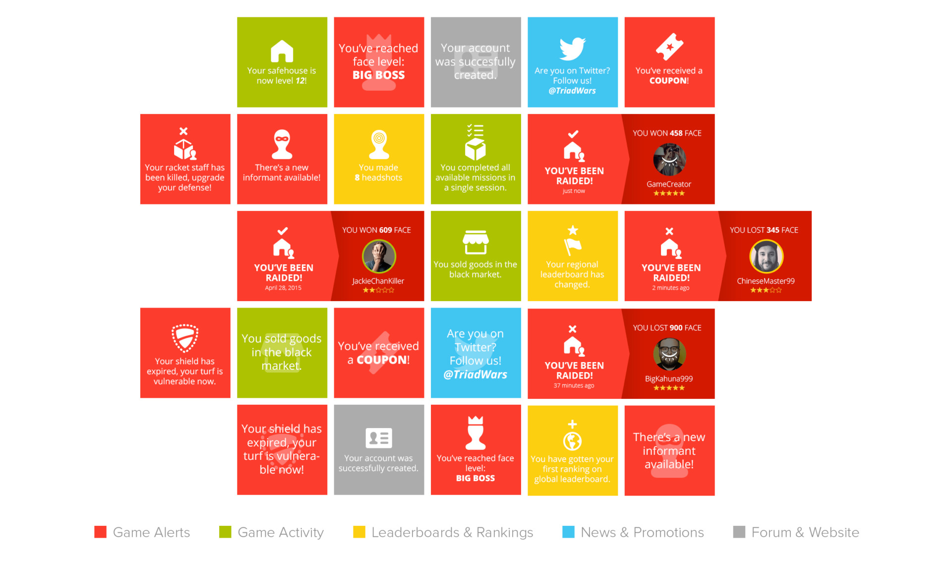
5 kinds of footprints:
News and Promotions
Game activity
Game alerts
Leaderboard and Rankings
Forum & Website
Colour coding
Triad Wars events and alerts system uses a 5-colour coded system to define and differentiate between the different kind of event types.
These colours are Red (for game alerts and attacks), Green (for game events such as achievements and milestones), Yellow (for leaderboard and rankings), Blue (for official communications and news) and Grey (for forum and web-related stuff).
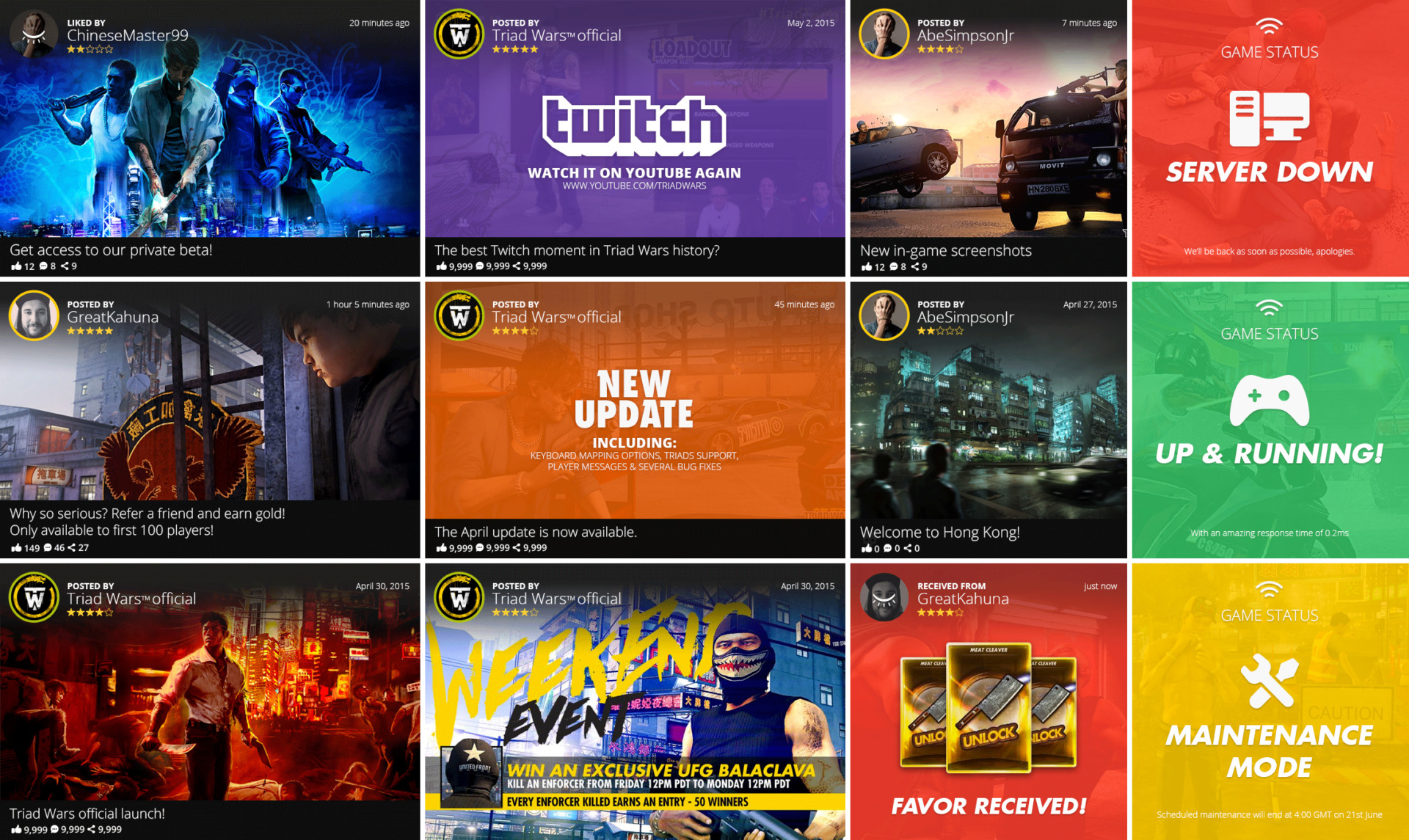
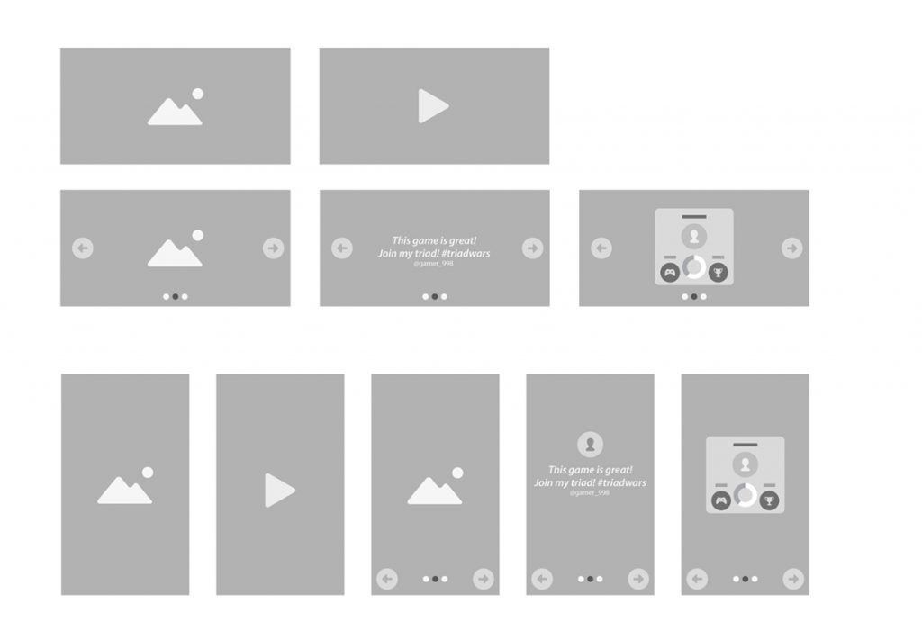
Building with blocks
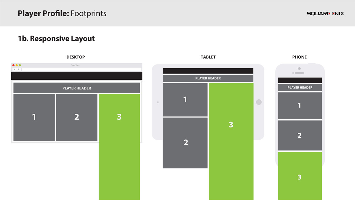
The main layout for the site is determined by a fluid grid system that is able to sort and position different content block sizes dynamically adjusting them to the viewport size of the browser.
There’s no sizes defined in the content stream but aspect ratios instead, with this we ensure the content will always look good on any screen without being limited by pixels, in our case we’ve used 3×2 and 2×2 blocks for articles or important call to actions such as registration buttons, big news and such…then some other smaller blocks like the 2×1 that serves as a game alert when another rival has attacked you, and finally, 1×1 blocks for all other alerts this last set of 1×1 blocks are also defined by a colour code.
Responsive web design
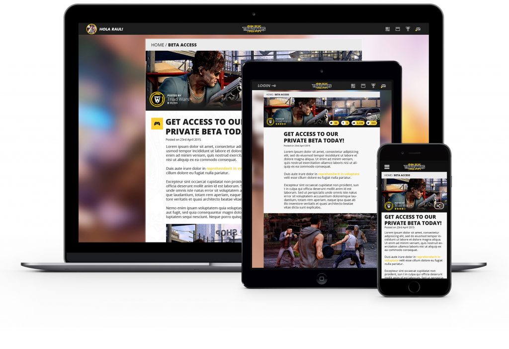
As part of the site redesign, I created new versions for many areas of the website, working closely with the front-end developers in order to polish and refine those points where the design needed a more flexible layout or a new breakpoint within the HTML.
Article screen
A big part of the site is filled with exclusive content and articles that are pulled out from a CMS. The article screen could be an article about some game features, a Twitch stream video from a new release’s gameplay or promotions and more marketing oriented content.
At this point there was a share function in place that wasn’t working in the best way possible in terms of UX, part of the redesign of this screen was to create a new sharing flow that would encourage users to share and promote the site’s content.
2 different share process were tested, a custom designed solution vs a native sharing process, at the end we included the native option which required less clicks and also gives users a sense of security and familiarity improving user’s sharing ratio.
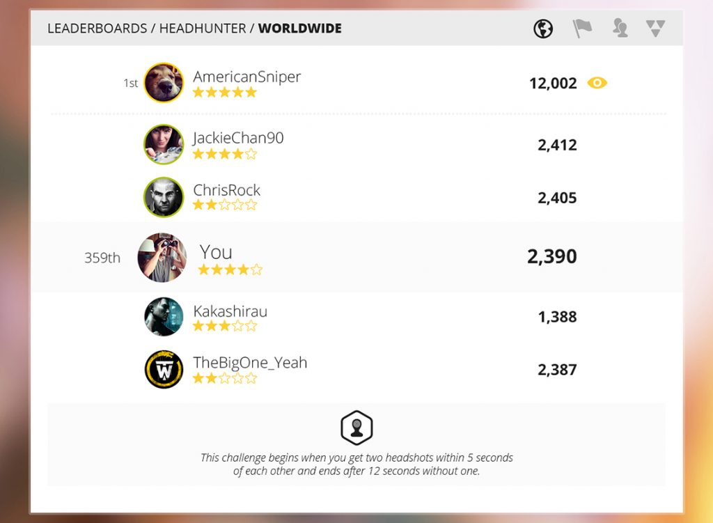
Leaderboards
The game is full or challenges, rewards and rankings. This screen is the leaderboards’ selection screen.
Each leaderboard has an associated icon to it, and by tapping on it the player would access to that leaderboard table.
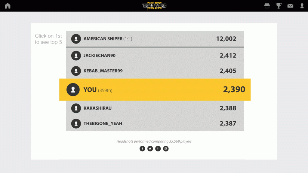
Ranking screen
When an user access a leaderboard screen, he will be able to see 5 other player’s position, 2 above and 2 below plus the very first player on that specific rank.
By clicking or tapping the 1st player on the list, the ranking will change with an animation to a “top 5” kind of table, showing the player who’s on top of the list. This shortcut is helpful as it gives the player a better idea of how the top table is doing it, most games that include some sort of “ranking navigation” has some chunky controls or the response time is very slow.
Micro-interactions
This animation is part of the UX documentation that’s been delivered to the dev team in order to give a better insight on the final animation look and feel.
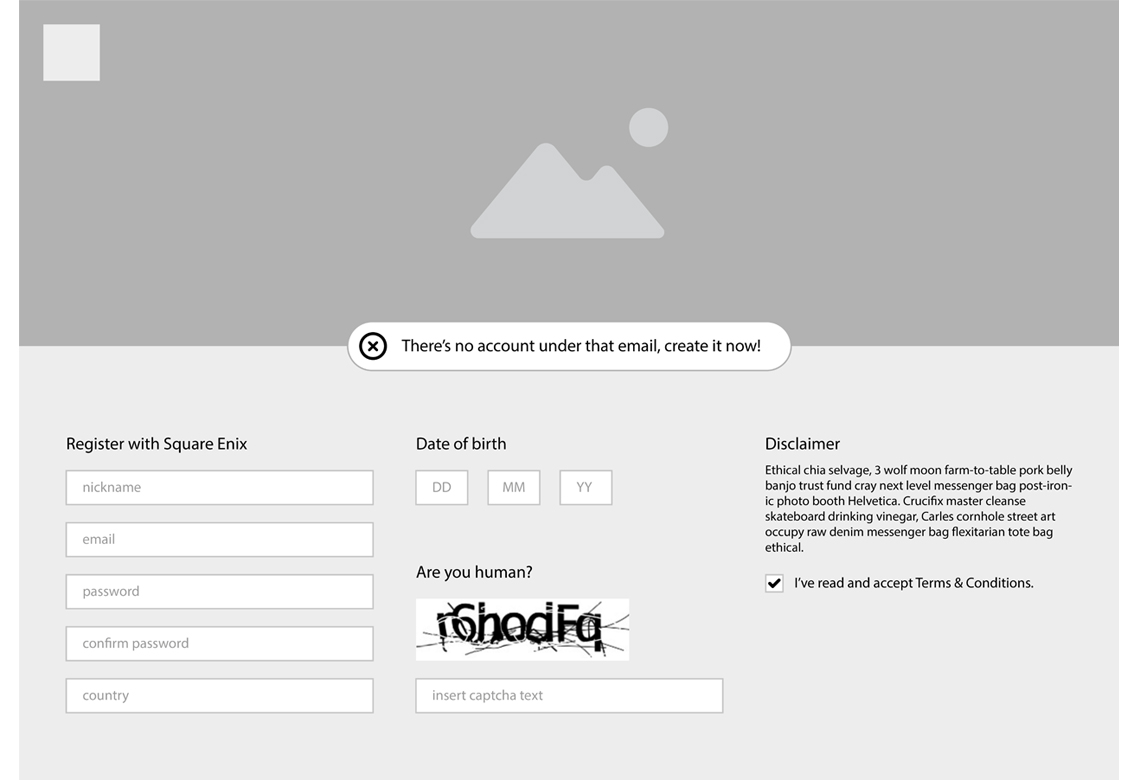
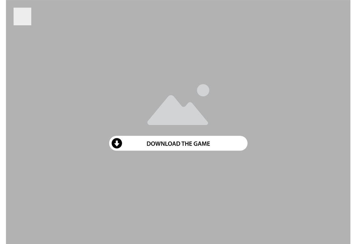
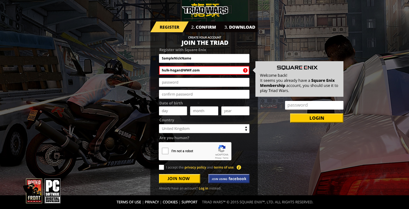
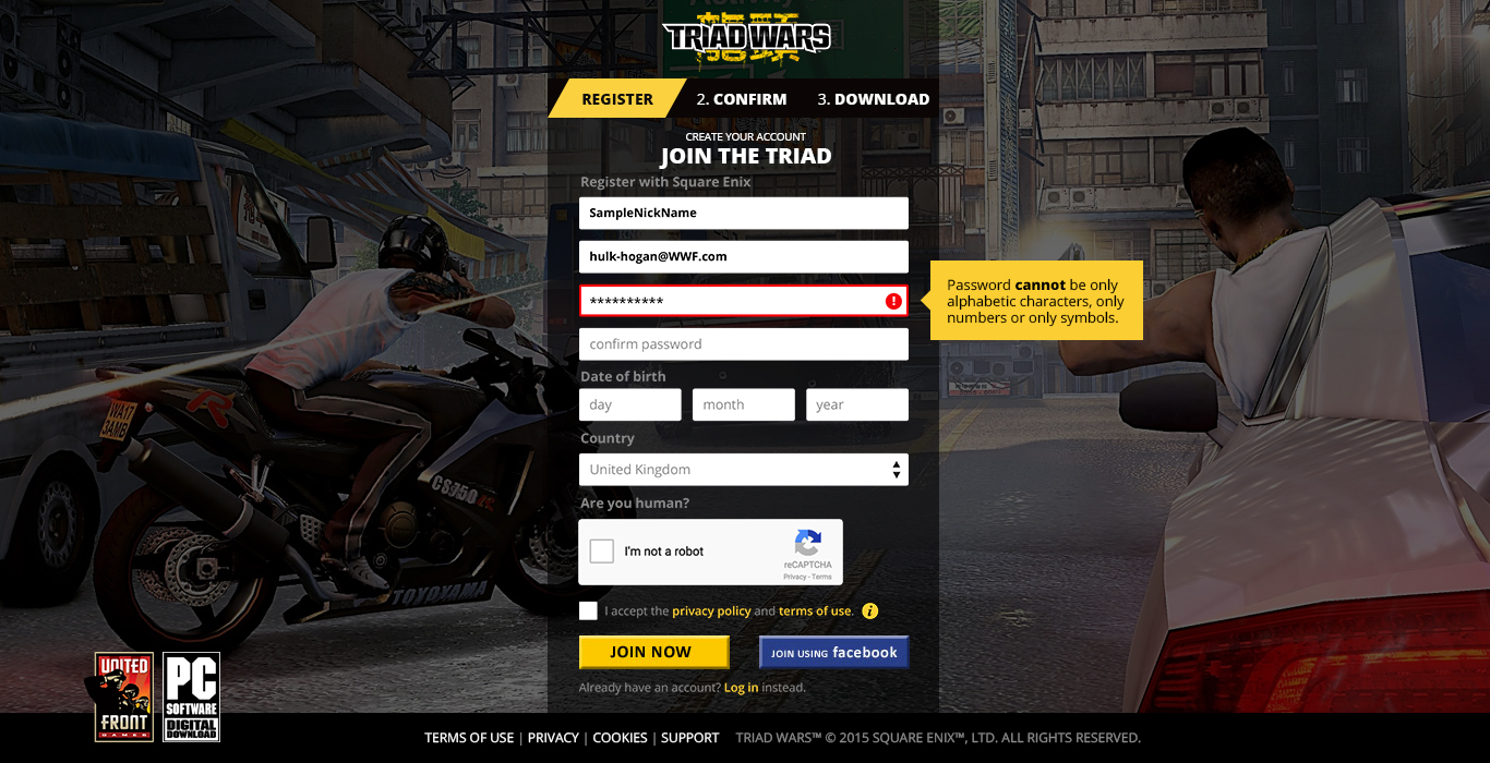
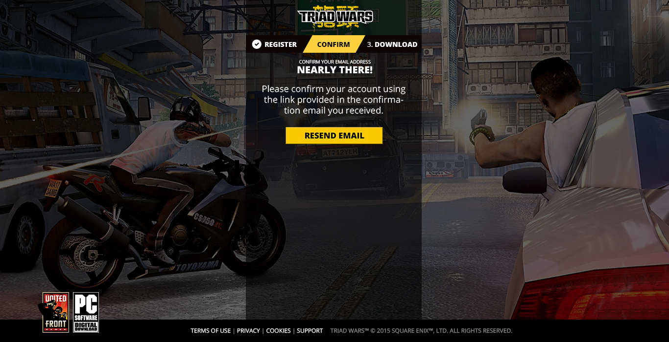
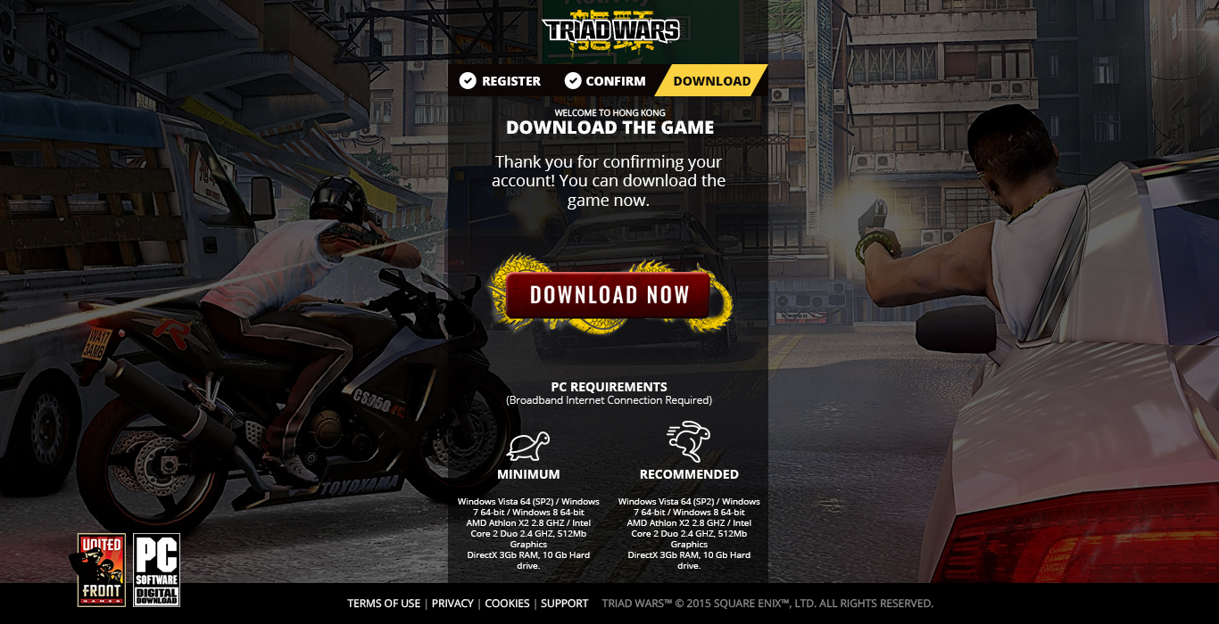
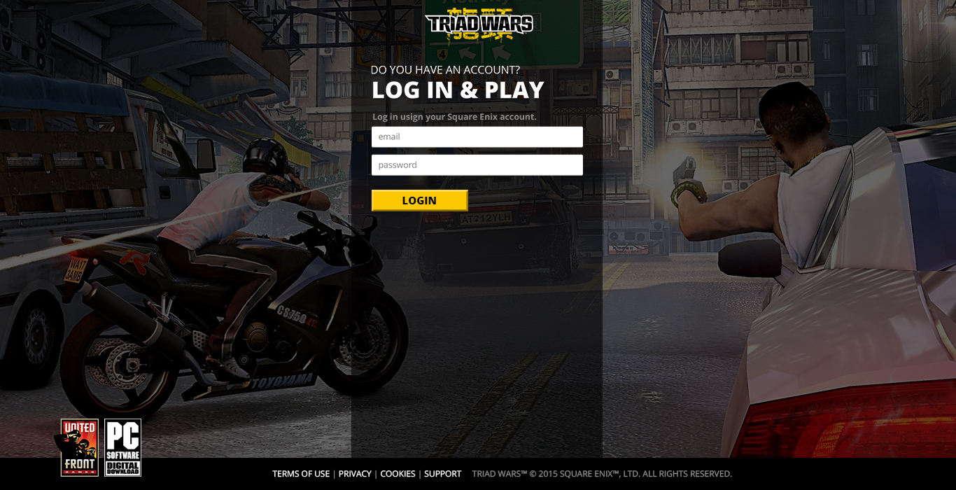
Landing in the right place
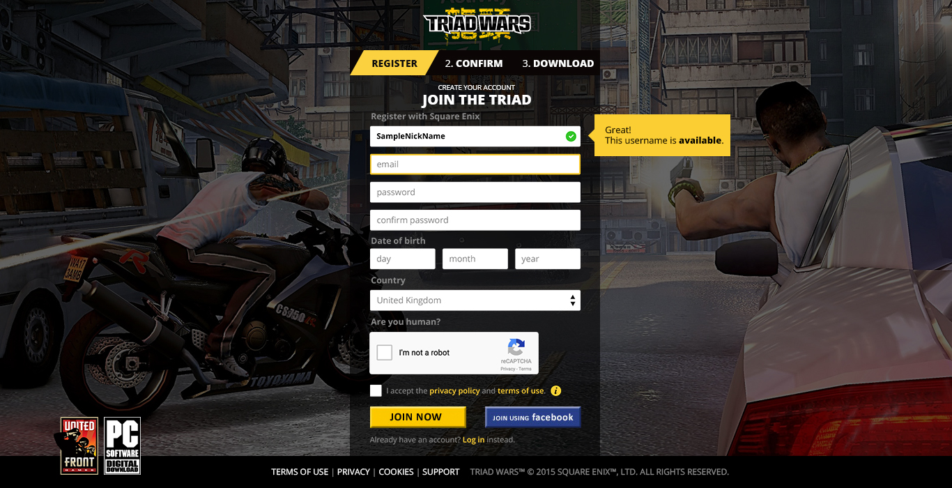
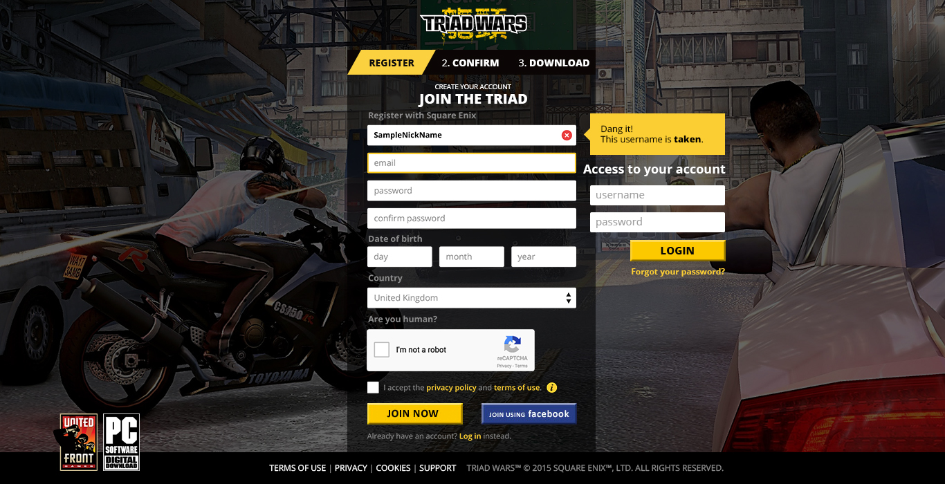
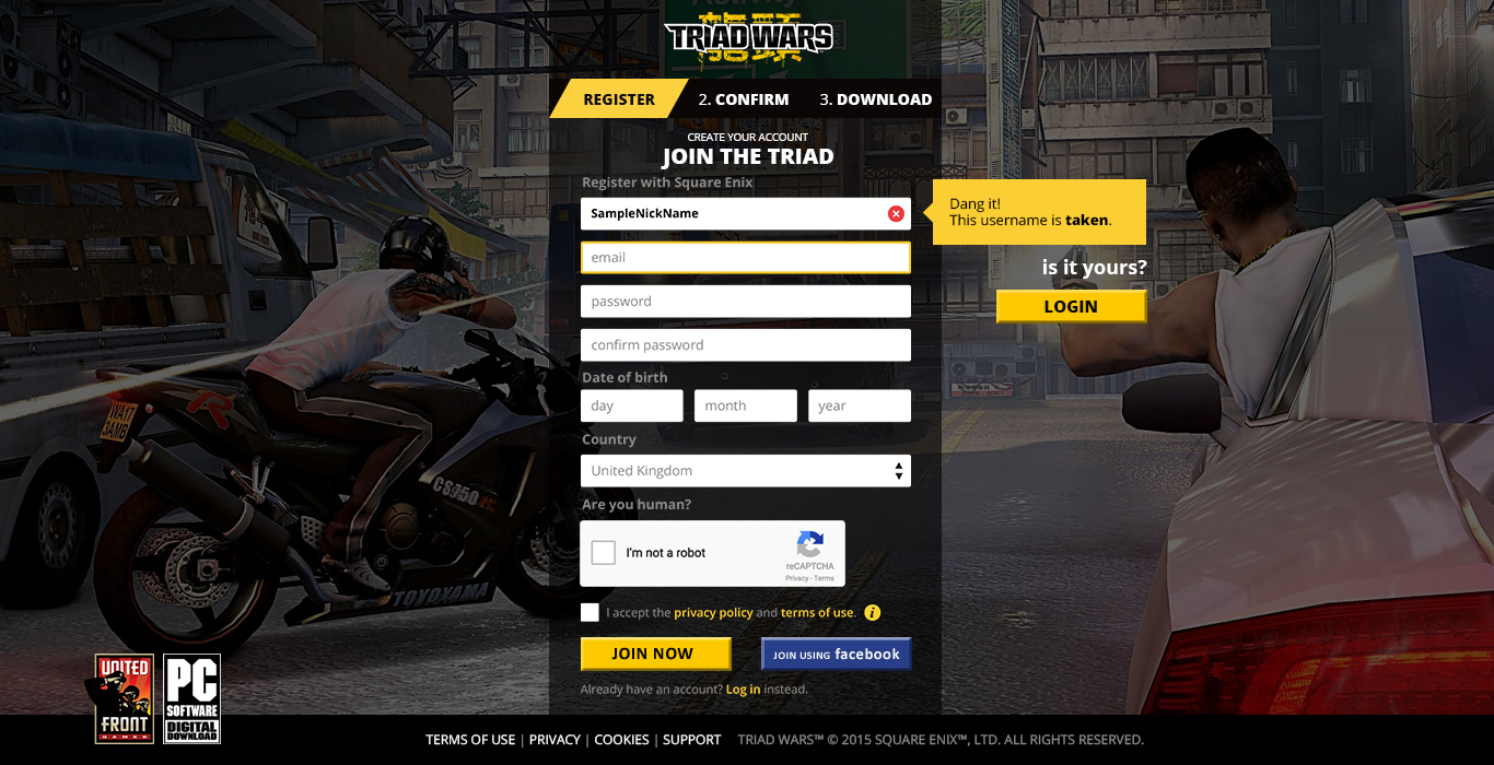
One of the tasks that had more iterations was the landing/download page. As one of the crutial parts of the whole site, we went through several design reviews before signing it off.
Some stakeholders had the concern of not having a flexible medium to test, adapt and change this landing page on the go without much trouble in order to get as many people through the registration and download flow.
For this, I designed different templates/layouts where some elements were dynamic, and with help of a CMS the marketing team would be able to manage, edit and launch different campaigns or strategies.
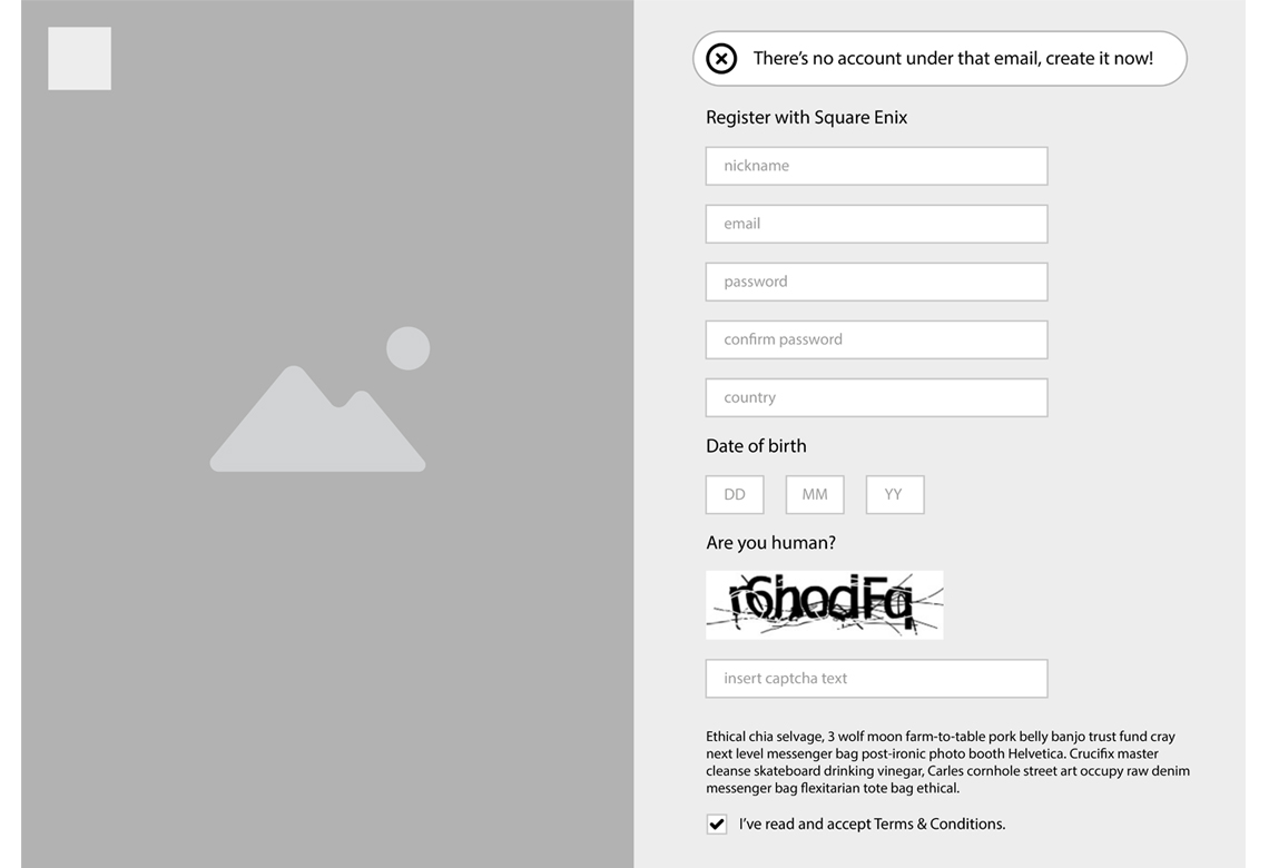
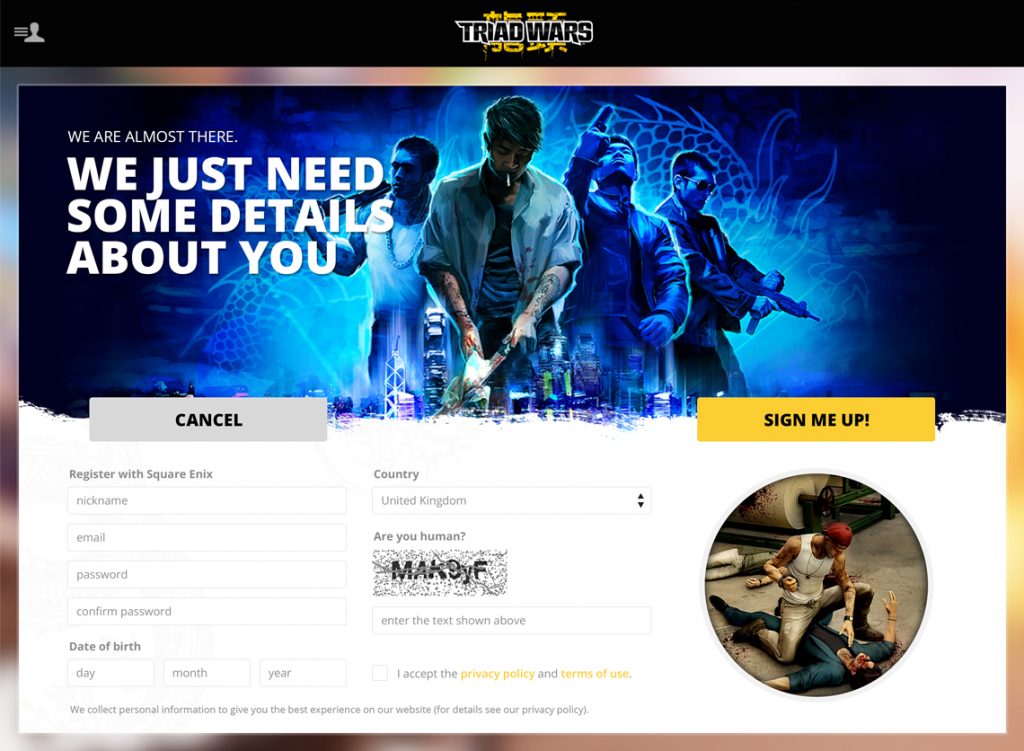
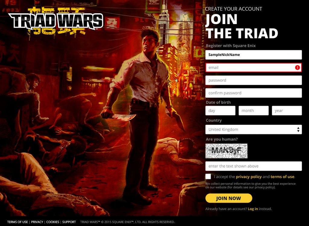
Final Version
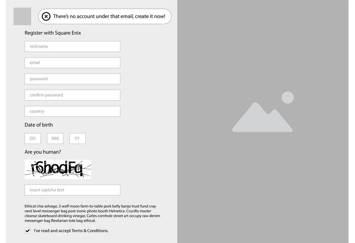
After many changes, this is the version that is currently online and serves as registration process for new players coming from different sites.
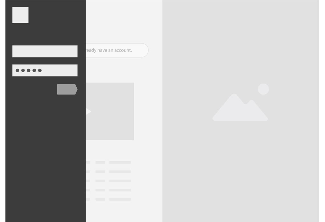
Mobile prototype
This is a quick clickable prototype I created to showcase some transitions and to test some user flows across different processes such as sharing content, login/logout and accesing different areas of the website.
Feel free to explore and navigate through the mobile site on this prototype.
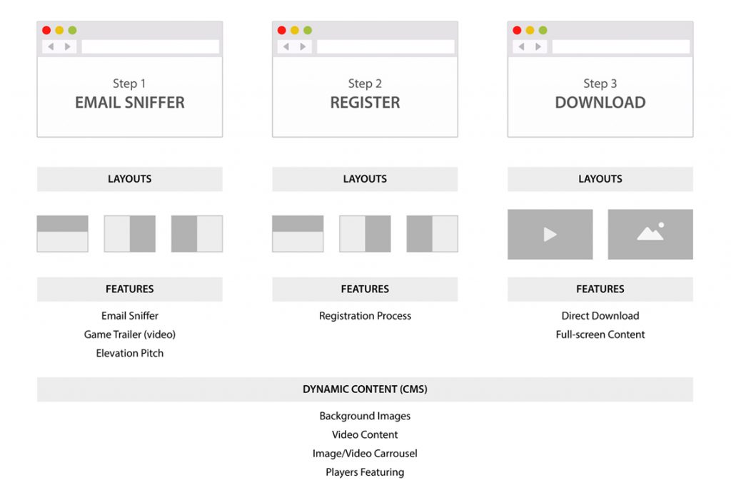
A template-based design
In order to build a site that is scalable and flexible enough, I created a set of rules that would help the team to create new sections in the future.
Media blocks
I created some component-based blocks of information for different purposes and responsive ready.
Sad news
Unfortunately, the game was cancelled during its beta phase but it was a very exciting project and my first within the video games industry, I must to admit one of the best bits of my job here was to play the game to better understand the mechanics and put myself in the skin of the players.
All in all, I share the feeling of the development team as they communicate in their final statement:
“We’ve loved seeing how you’ve played Triad Wars but we know it wasn’t right for many of you.”


