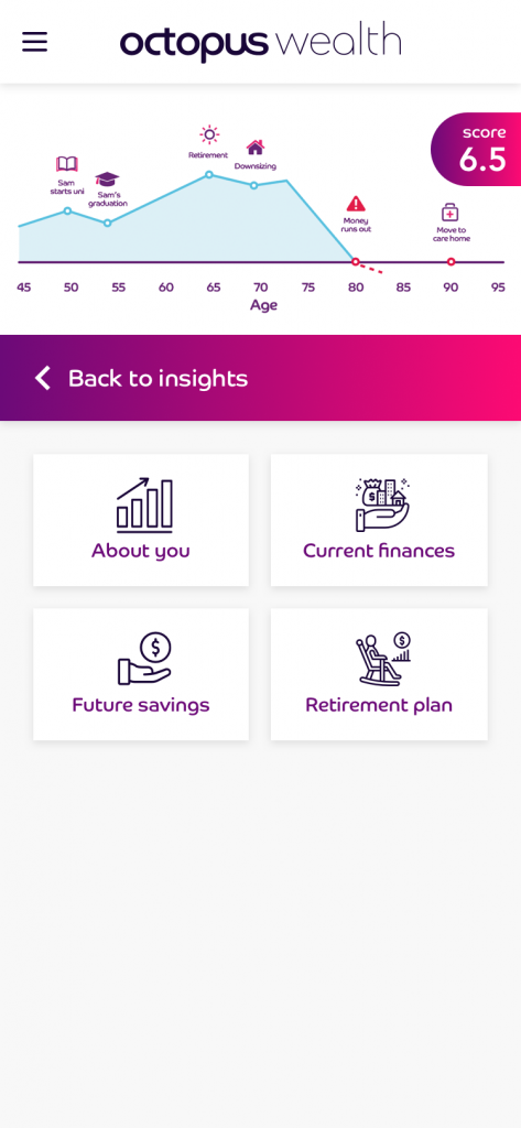
The product team entrusted me the task of designing the experience around the concept of a ‘Lifeline’, such line would include all relevant financial information and life milestones in the life of users, giving them really valuable insights about how to manage their assets in order to achieve their life goals.
User journey + personas
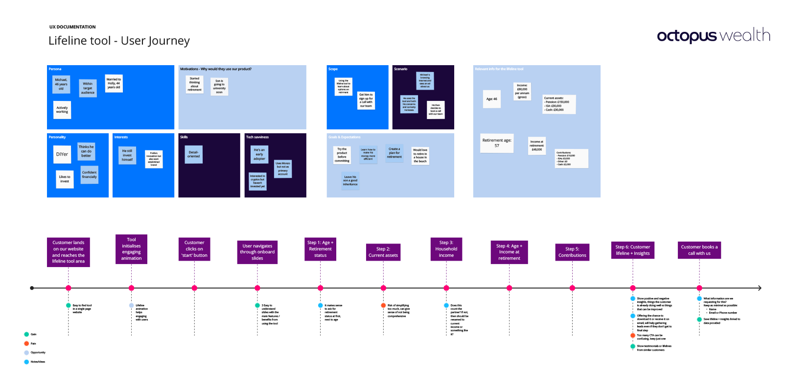
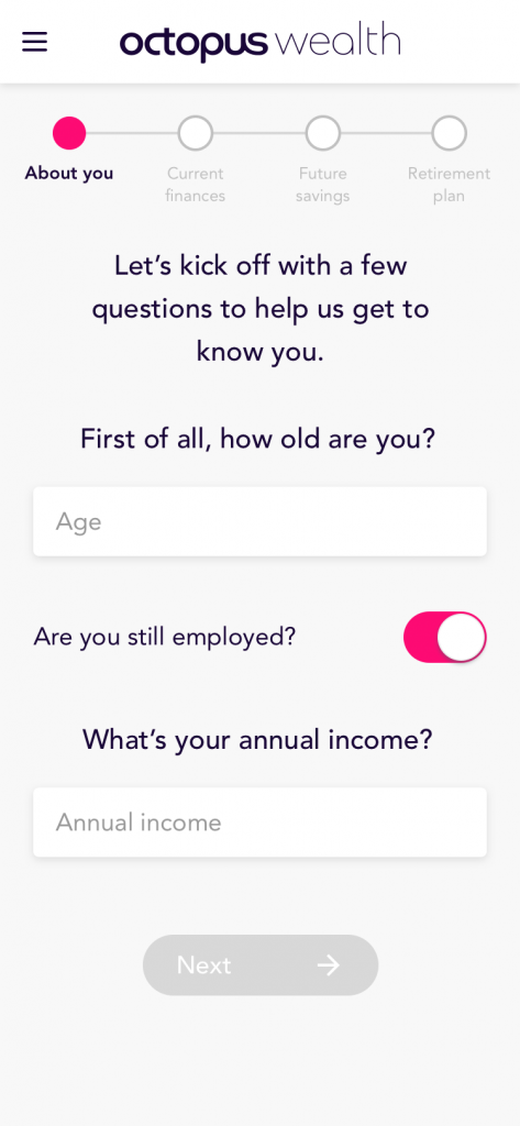
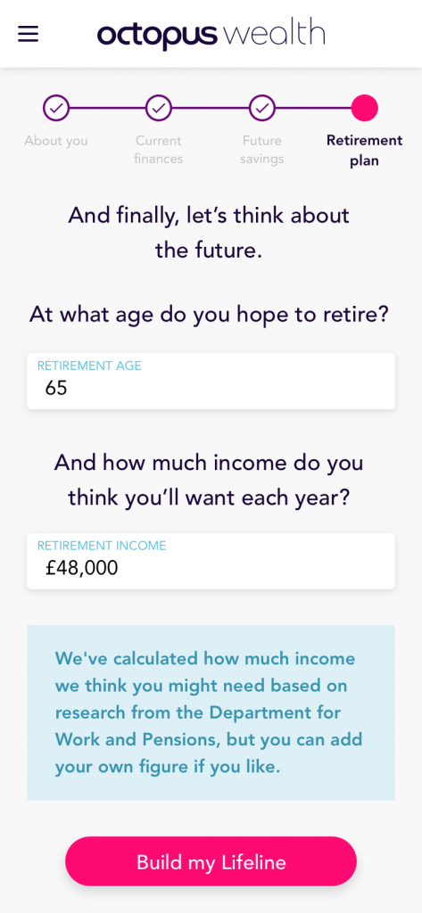
Based on previous UX research that the internal team at Octopus Wealth provided, I developed a persona canvas and a main user journey that will help us discover any bottlenecks within the tool and take advantage of any opportunity that we could foresee.
Testing interactions
One of the most crucial parts of this tool was to get right the way users would interact with the Lifeline and all the different life events that would be represented on it so I did some explorations and prototypes.
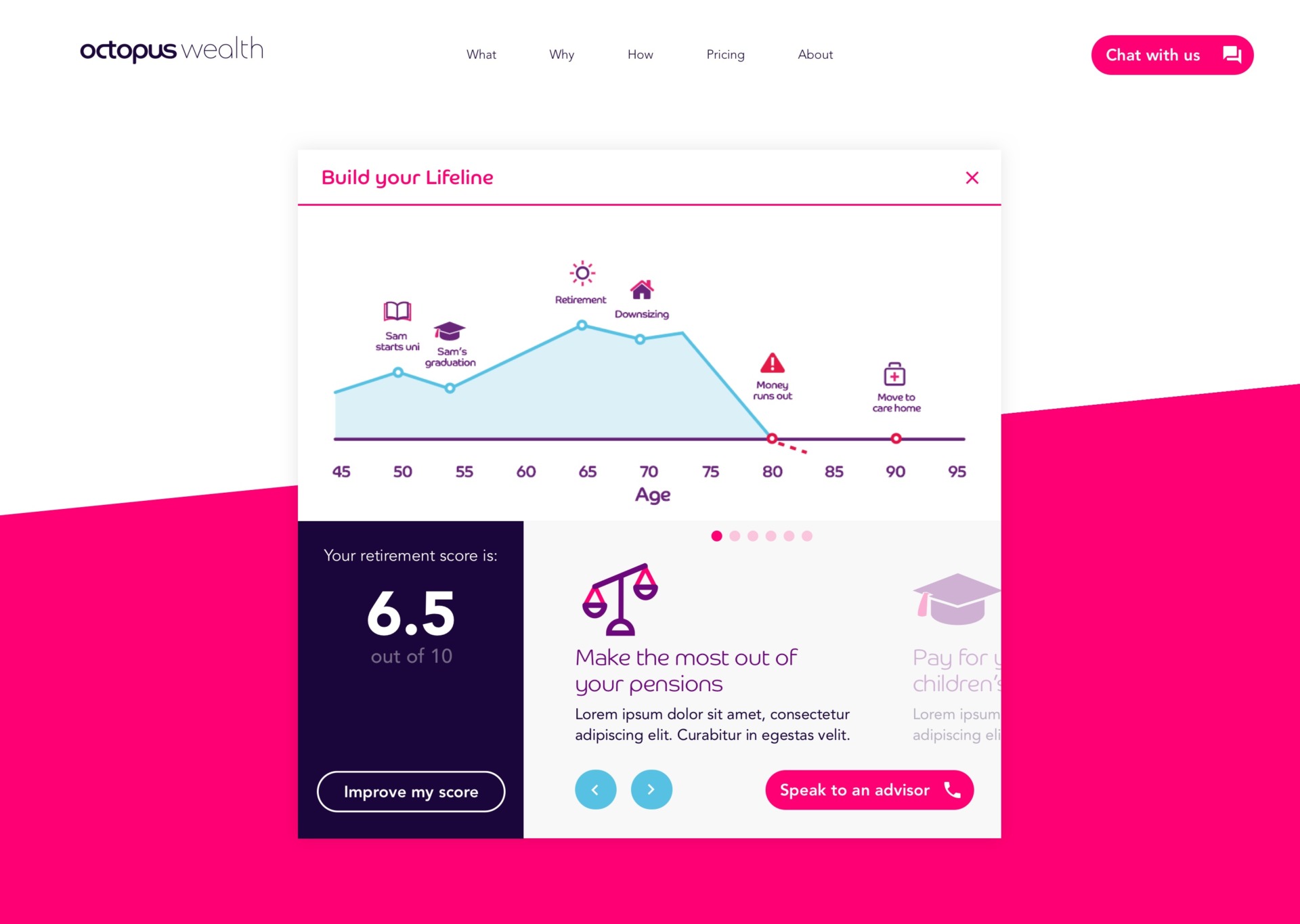
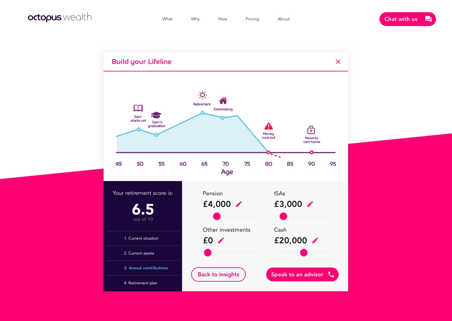
Real tailored insights
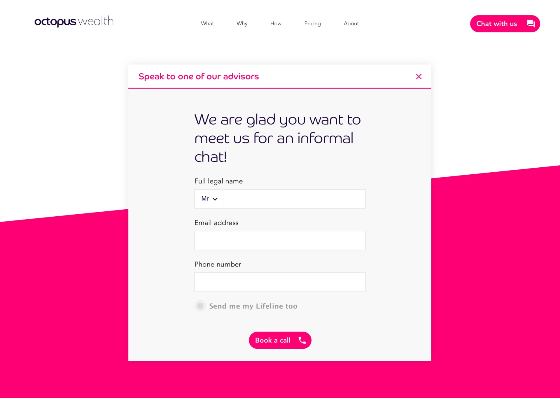
Since this tool was conceived within the product and marketing departments, one of its main goals was to serve as way to approach potential customers and help give that first handshake that will build trust and gain visibility agains the competitors.
But as an experience designer, one of my main concerns was to offer real value versus being only a customer data gathering gimmick, so we focused big part on our efforts in building a matrix of many different piece of advices that would be mapped to real calculations made based on users input, giving them a final set of insights that would help them to improve their financial situation, customers or not.
The team I worked with was key to achieve this as they had the knowledge that I needed in order to meet that goal.
Responsive-ready design
I did many explorations of different layouts that would work on both desktop and mobile as the tool should work responsively.
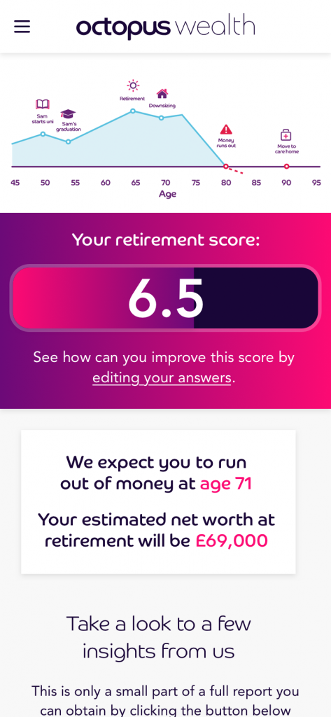
We also started working with the concept of having a ‘score’ based on the calculations the backend engine was doing and use that score to gauge user’s financial health.
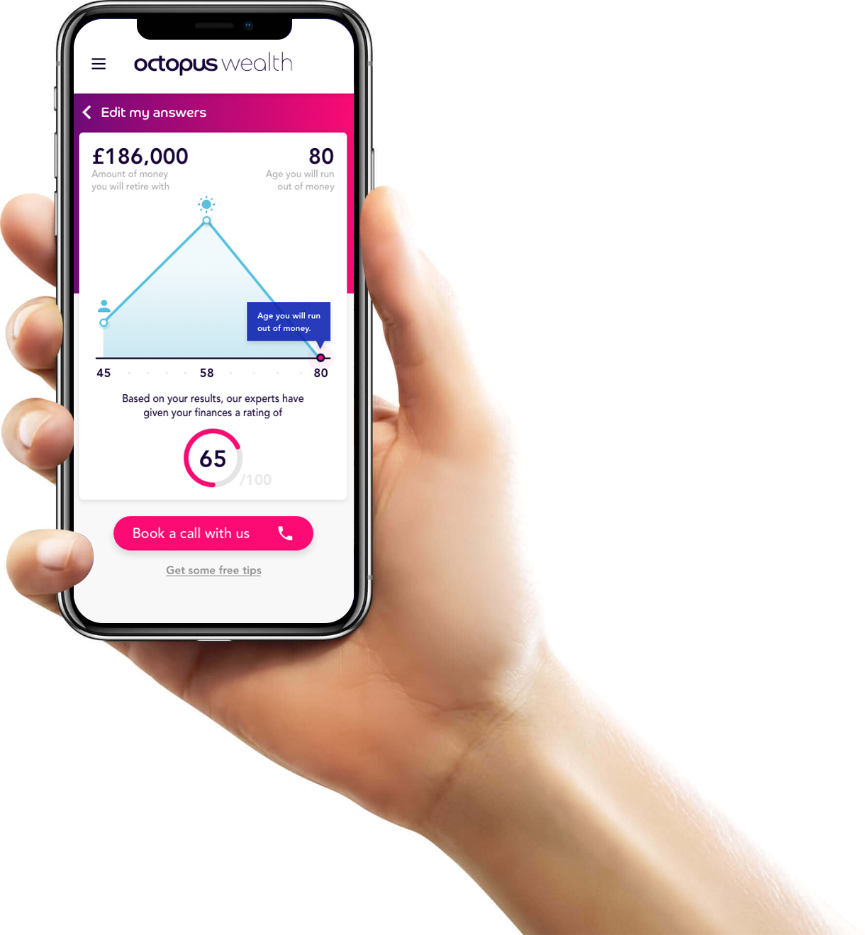
Mobile concepts
I started working on the mobile designs first and created a component library in Sketch that would end up being the source of truth for user interface designs that would be handed over to the development team.
The components designed were responsive ready, scalable and data based, so creating new screens would be much faster, streamlining my workflow.
Lifeline interaction
I had to find a way to interact with a chart in a compelling way without compromising the portrait mobile orientation, I played with the idea of zooming up the Lifeline using all the screen surface and binding the horizontal scroll to trigger events to expand into more detailed information.
I enjoy designing this kind of user interactions and come up with smooth and natural transitions between visual states, ease of animations and right timing is key in order to achieve the best results.
I use Principle for this kind of prototypes as is incredibly simple and fast to do transitions between different screen states.
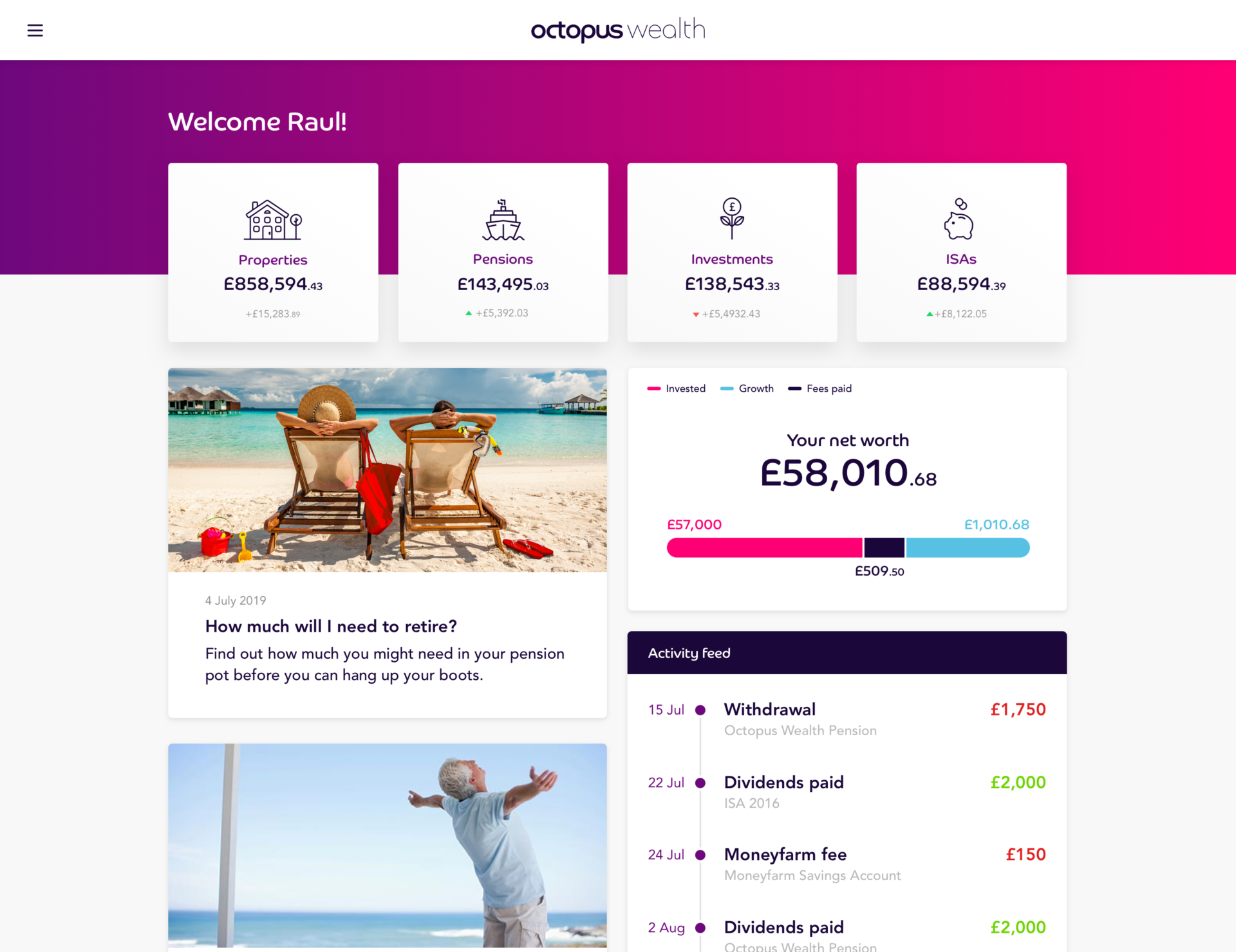
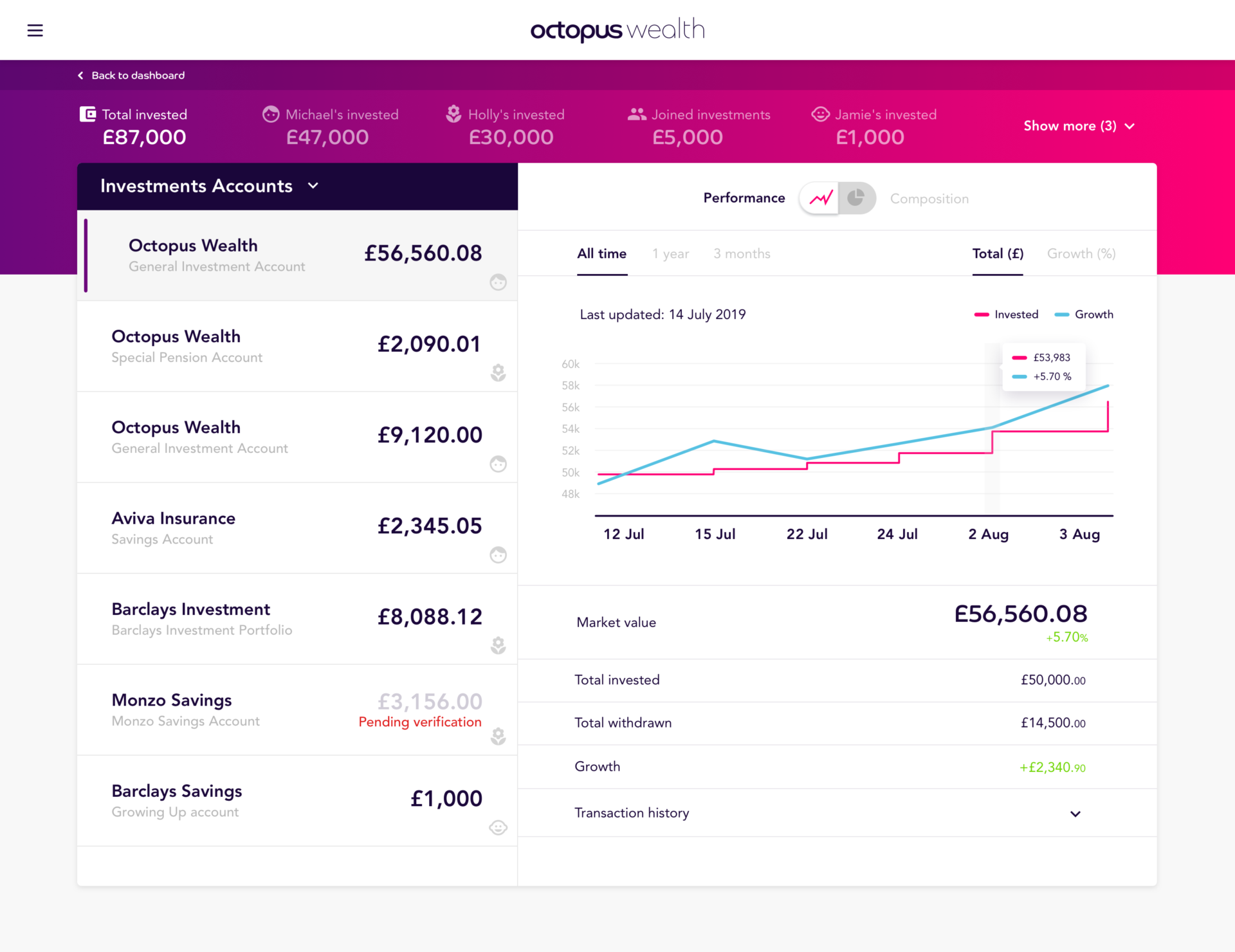
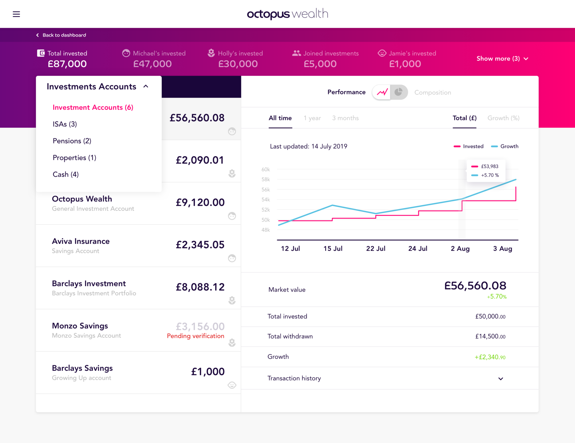
Internal Portal
As part of this project I also had to work with an internal application for clients where they could see their finances, this Portal will include some data visualisation elements and a dashboard view.
Prototyping iterations
I always enjoy prototyping, specially when I need to iterate through different ideas and concepts until the team is happy with the solution proposed.
Having a prototype to play with ideas is the best way to validate if an specific interaction is working or not.
Adapting to the medium
In this case, as the team already had a working product, I had to adapt some of the existing patterns and interactions to work on mobile, this project allowed me to work in a responsive platform back and forth from desktop to mobile and vice-versa.