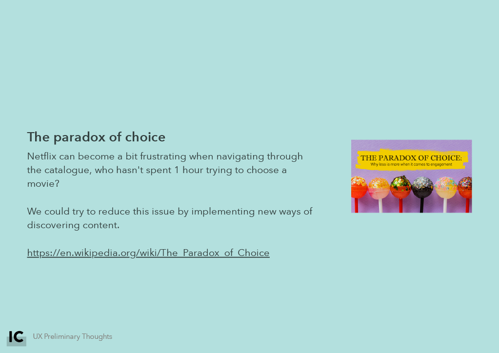
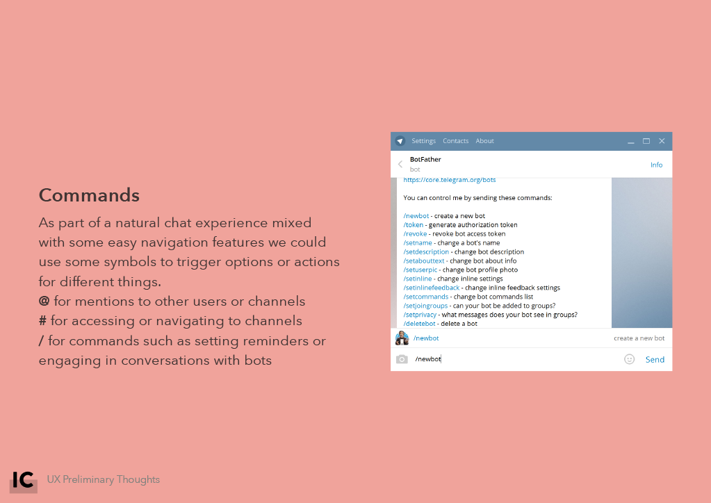
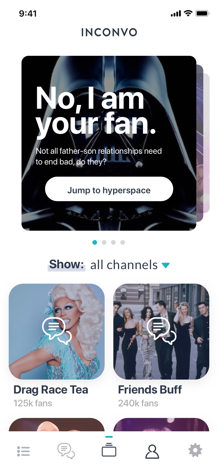
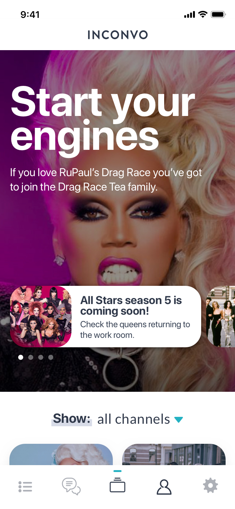
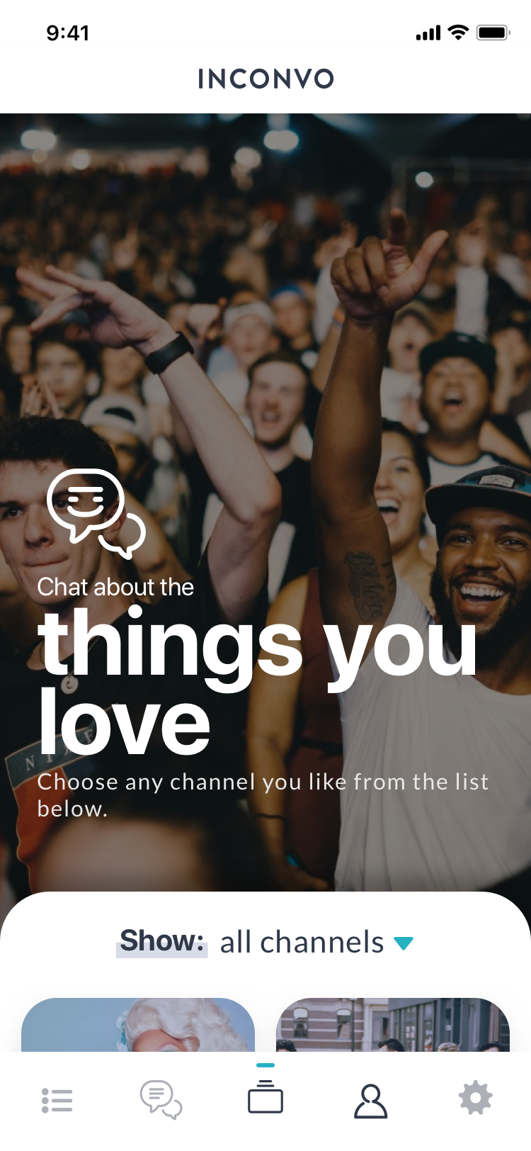
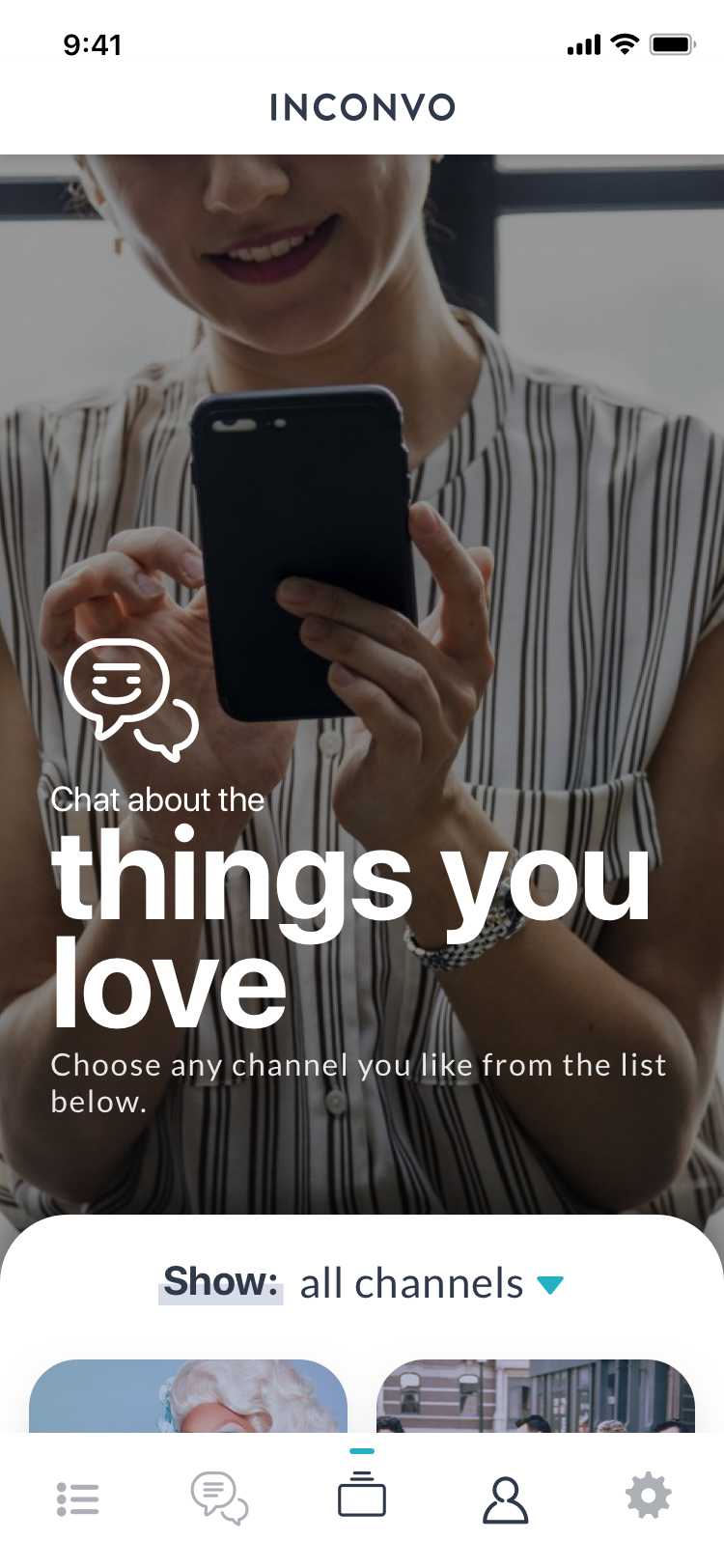
The road to release
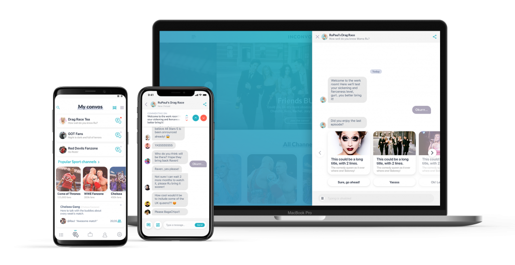
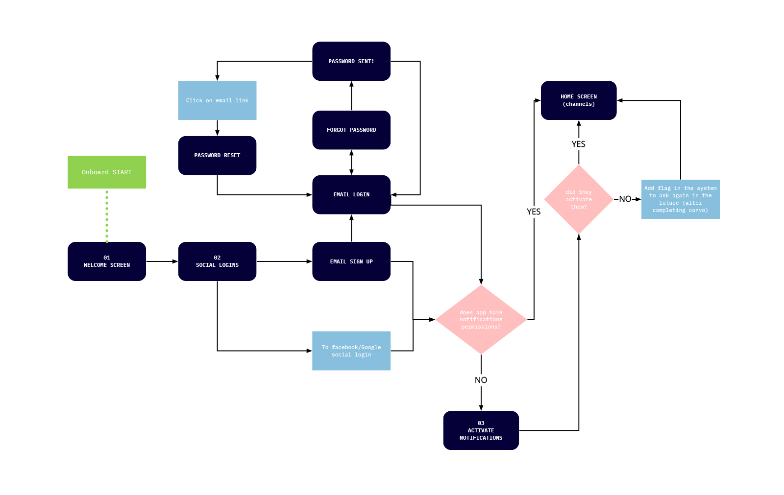
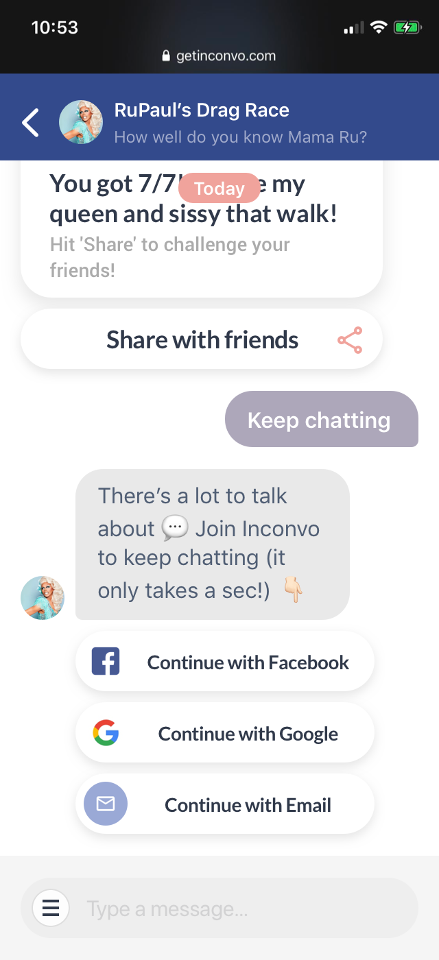
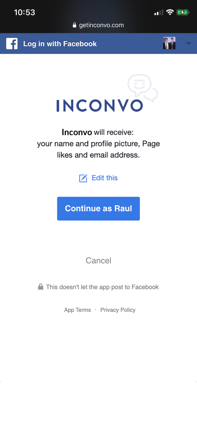
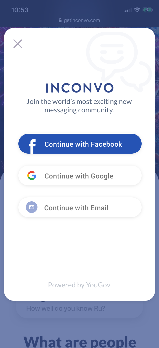
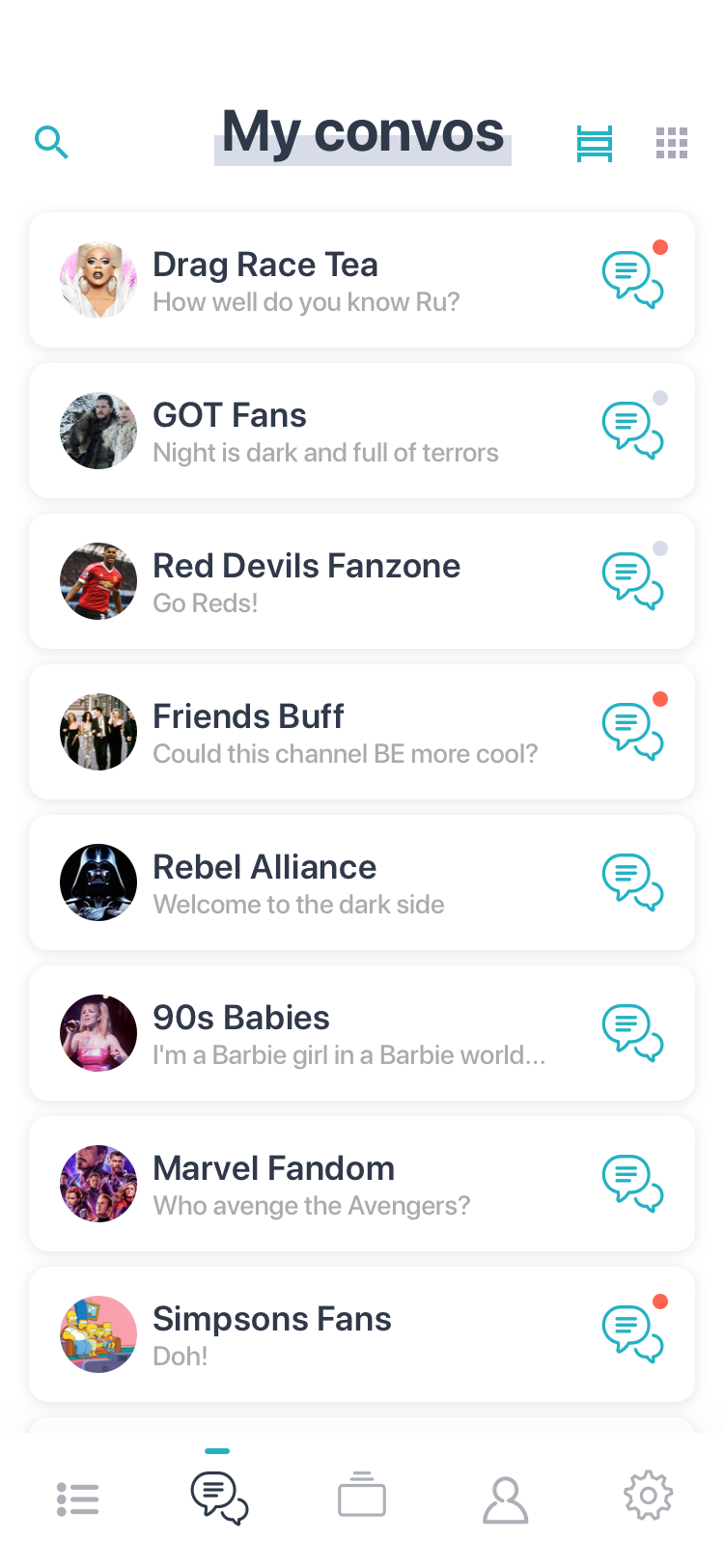
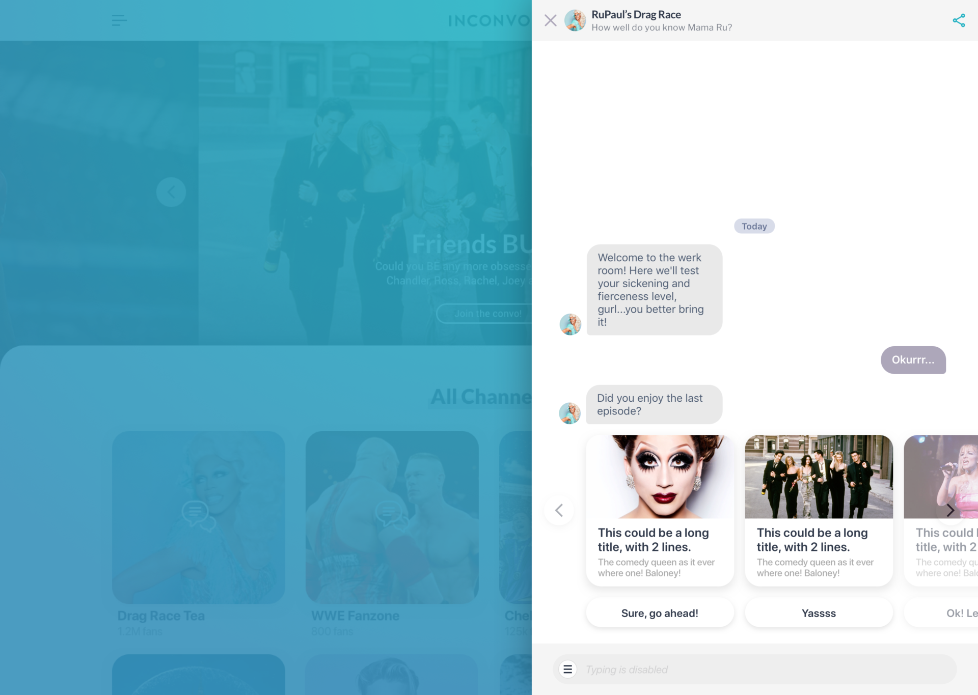
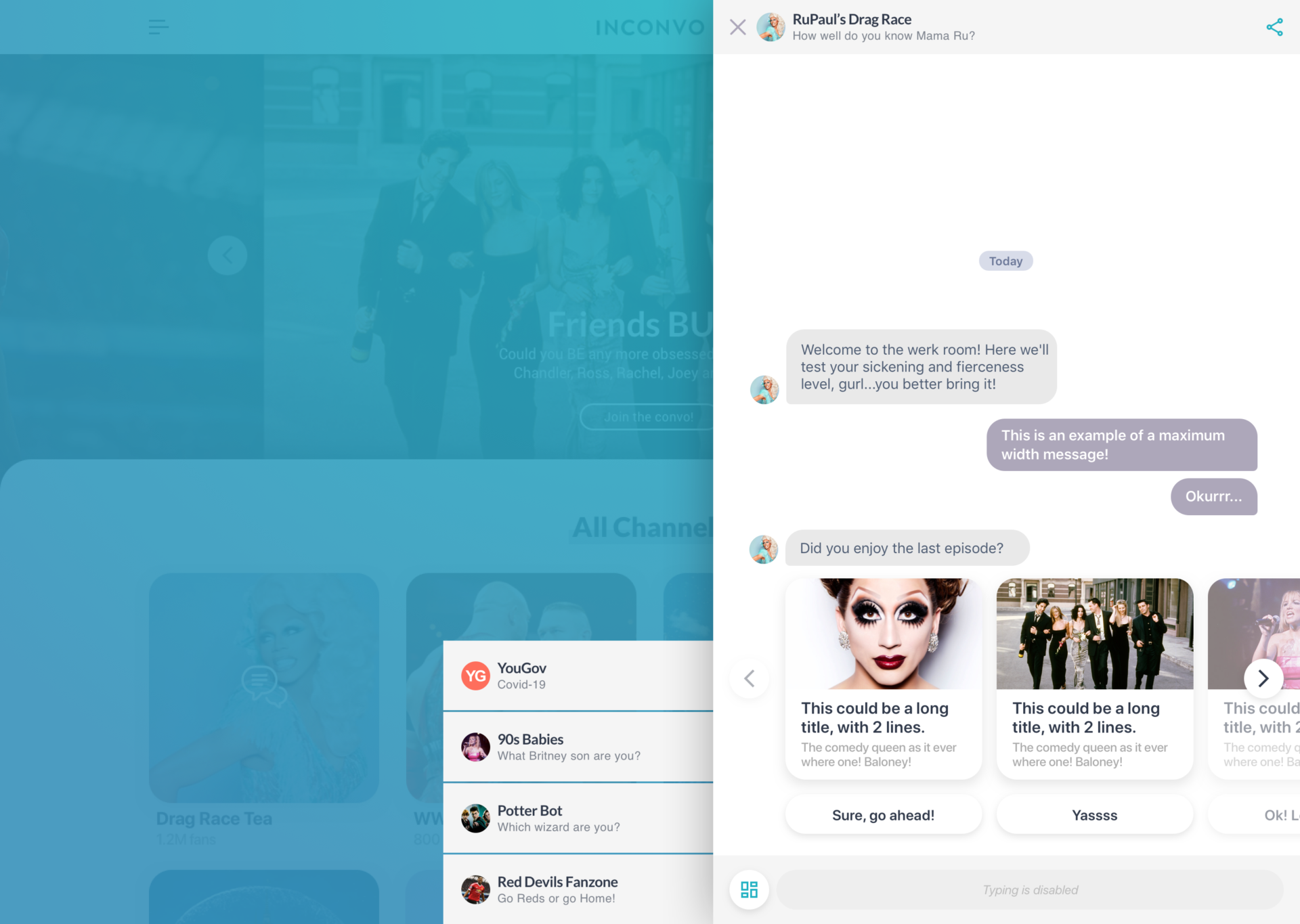
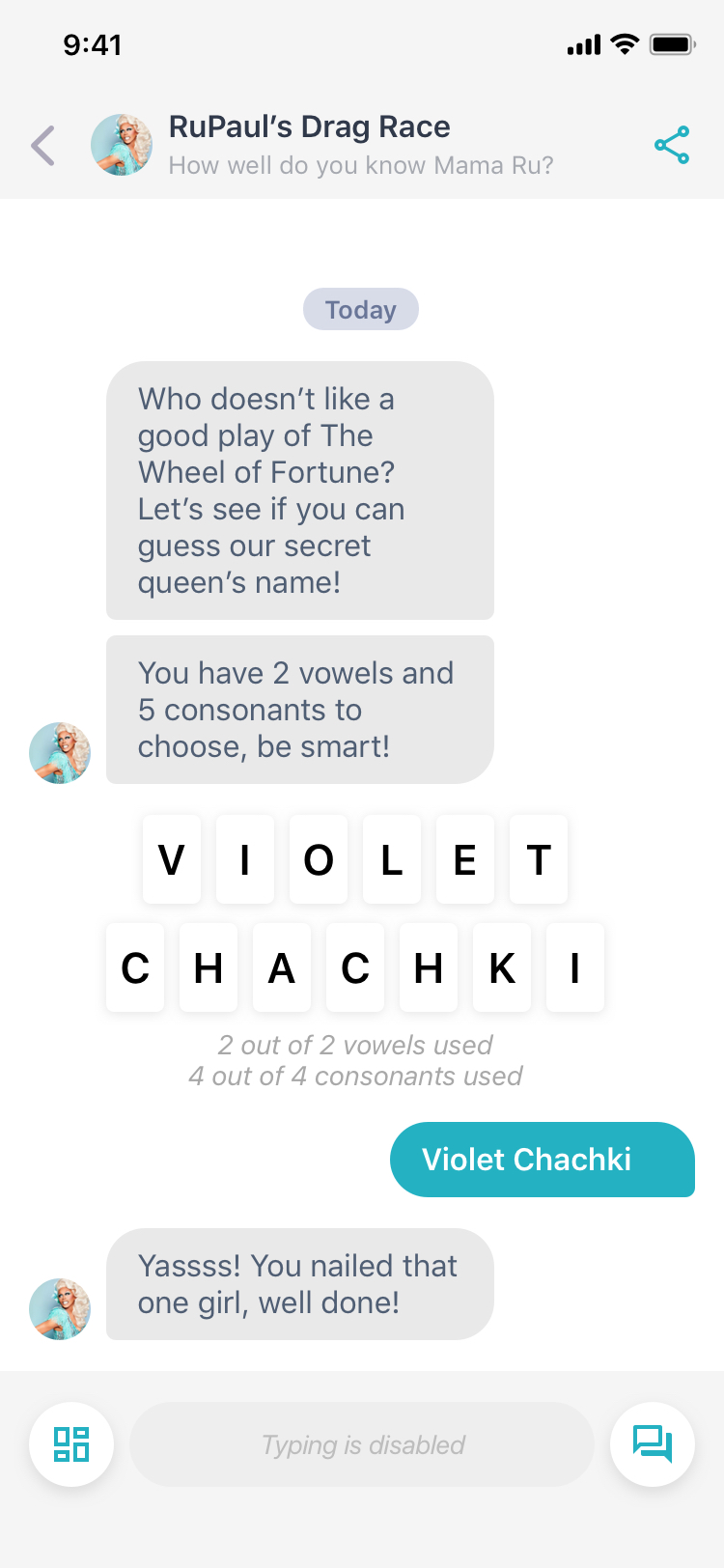
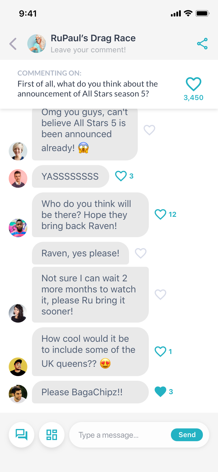
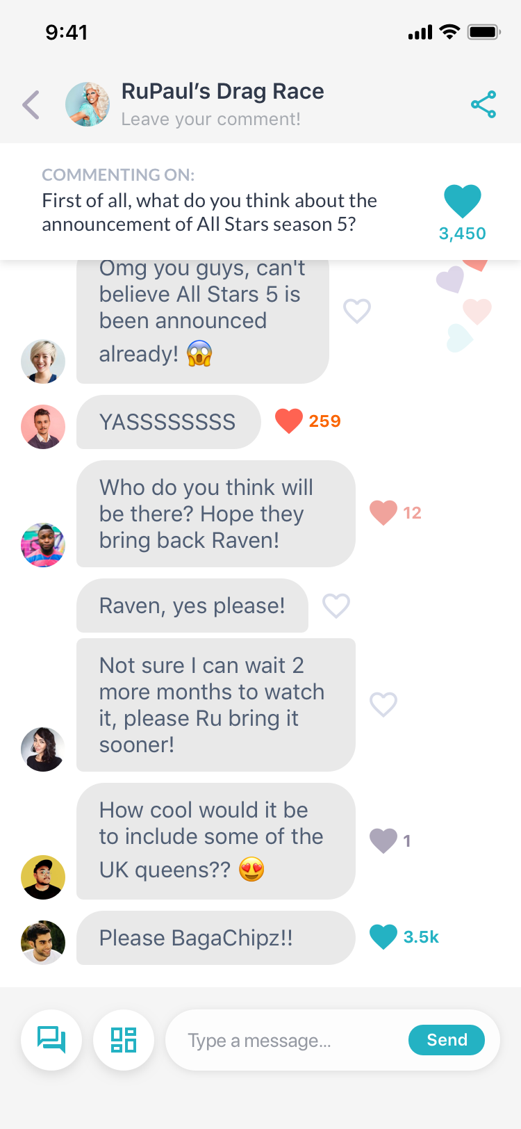
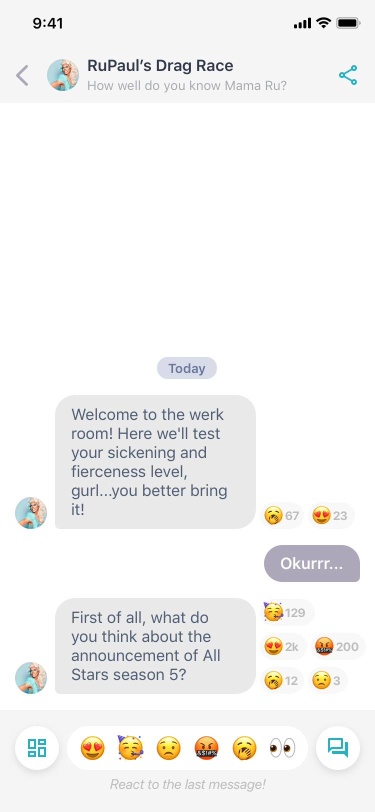
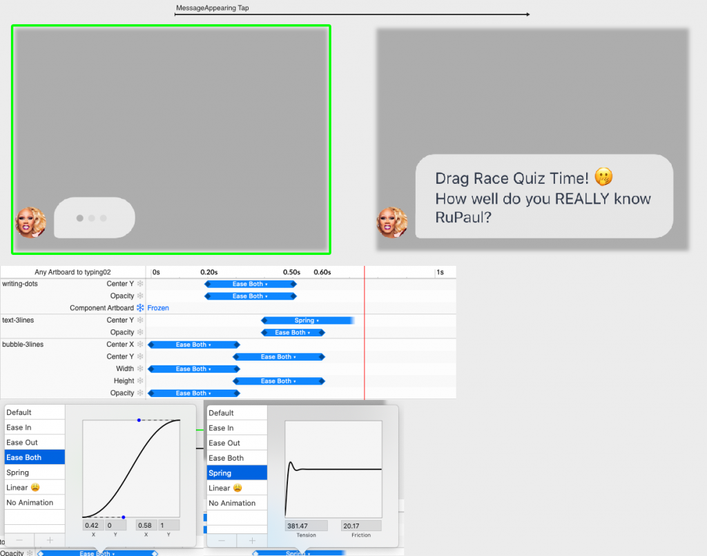
While I was working on the main user flows designs, the dev team had been working hard to get everything ready, from how the messages go from our servers to the users or the complete CMS application publishing features for the content creators in the new platform.
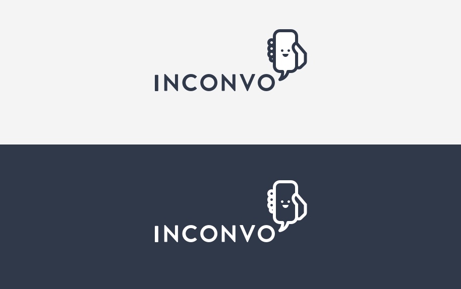
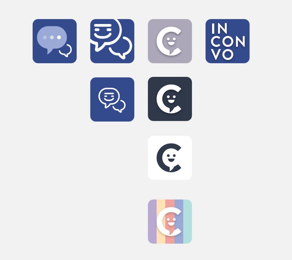
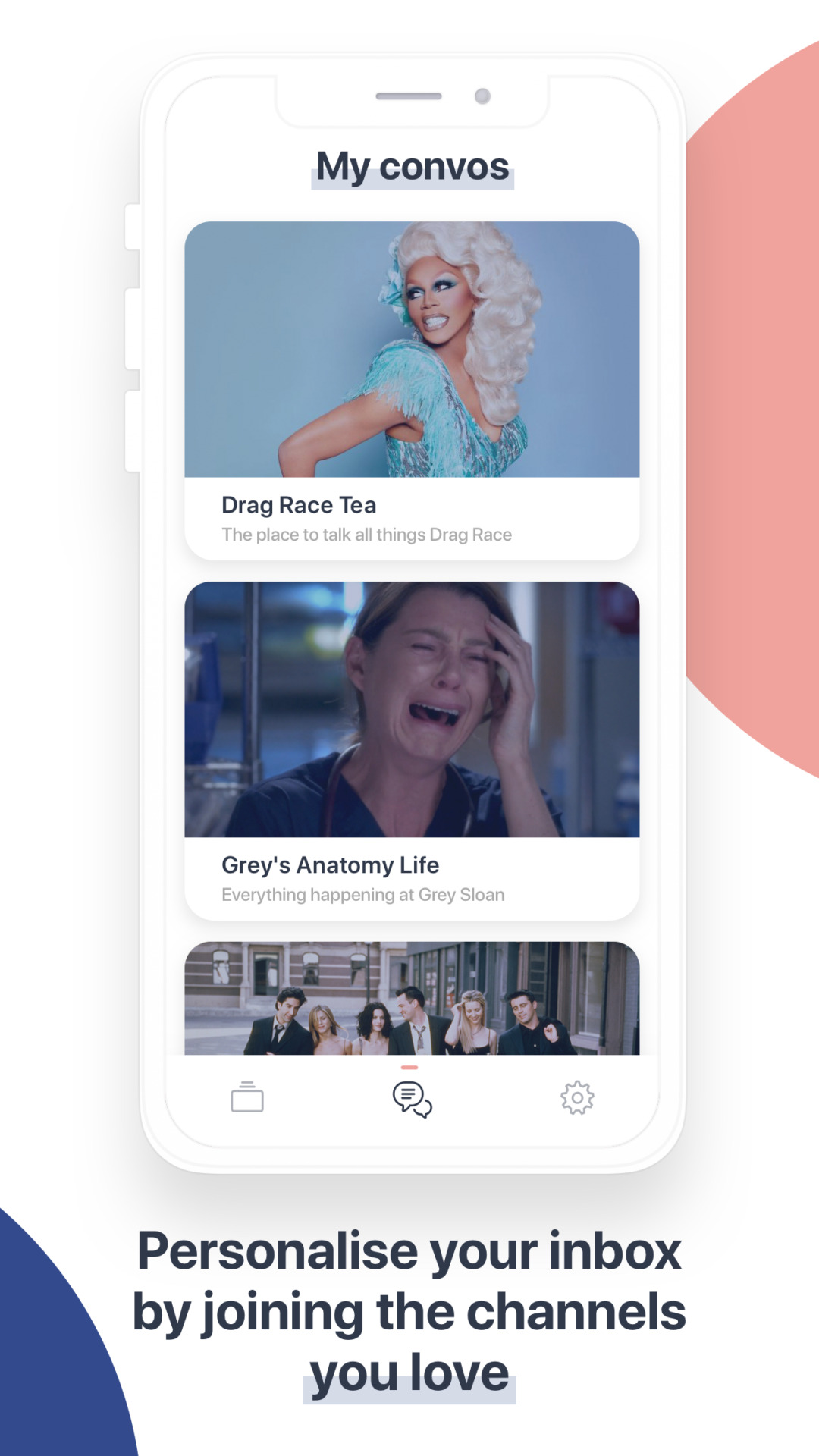
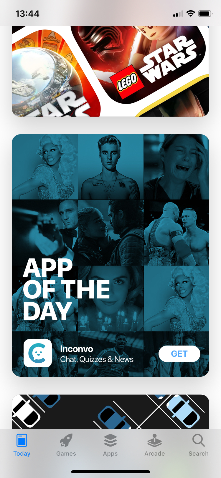
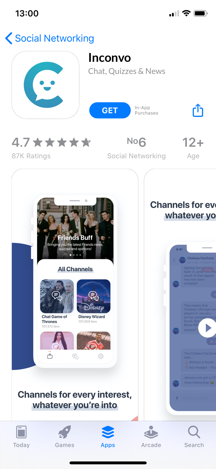
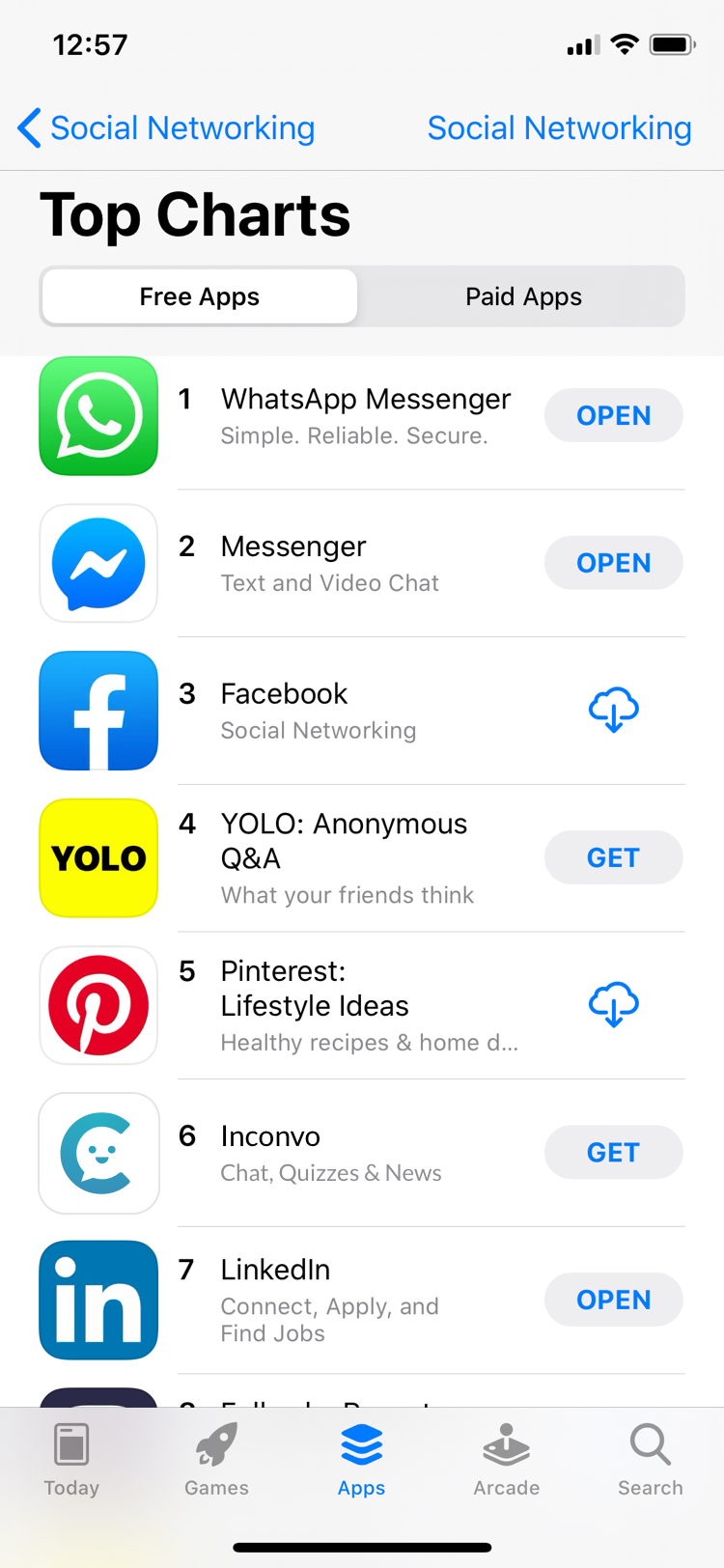
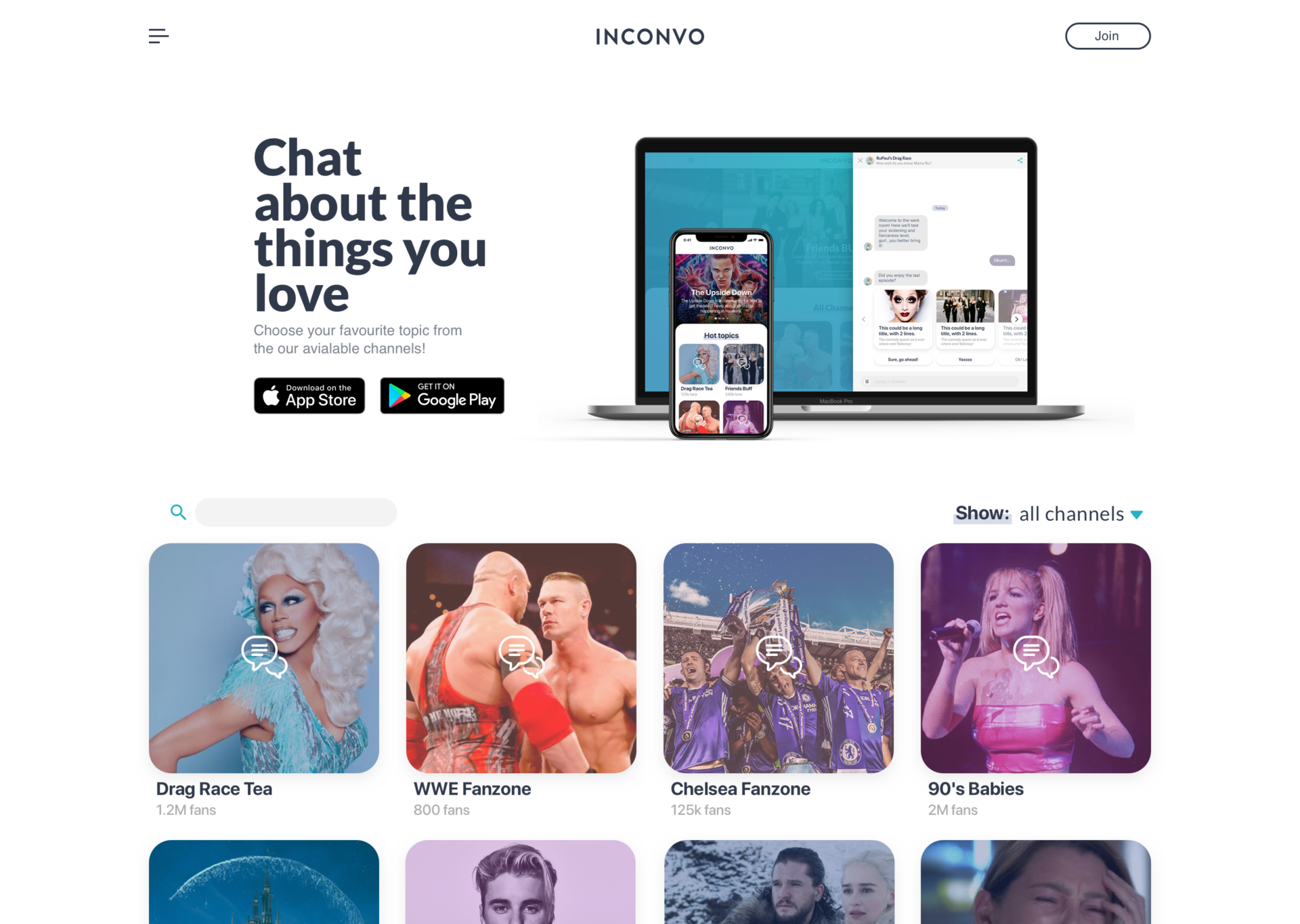
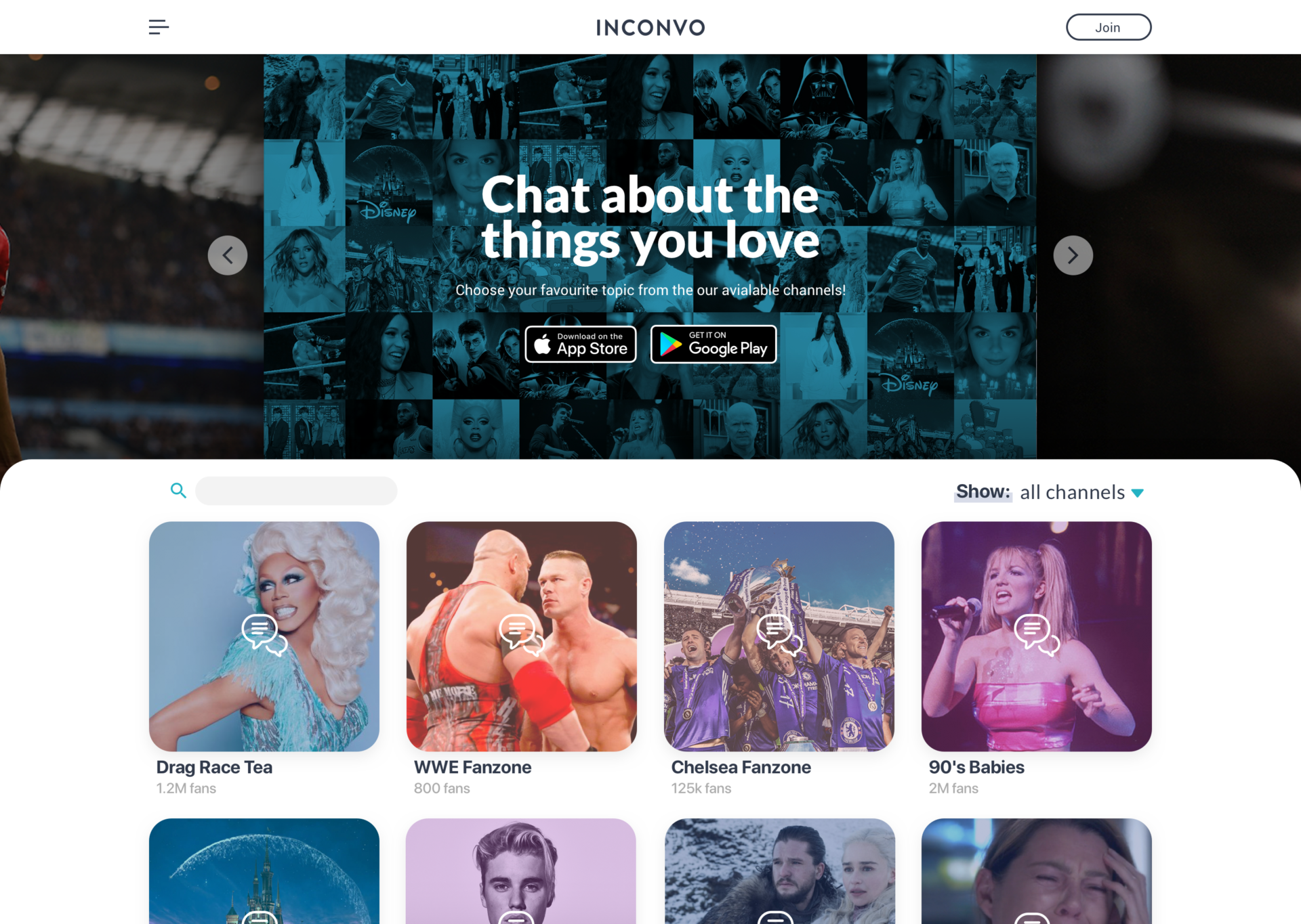
Once they were delivered, we started giving some final touches to the branding and preparing the promo and app store materials for release.