From the initial branding and office interior design to user experience design and prototyping, one of the most complete projects of my career in just a 3 month sprint.
The first part of the project was very exciting as we were asked to work in a future vision of the platform to see how the final product would look and what features could be achieved within the project roadmap.
When Trustology contacted me they were in need of a design team, or at least a designer that could be comfortable working in all aspects of design for a new brand/product.
This meant starting from the very basics and building up not only a brand image but also a compelling app that could fill a hole in the crypto world.
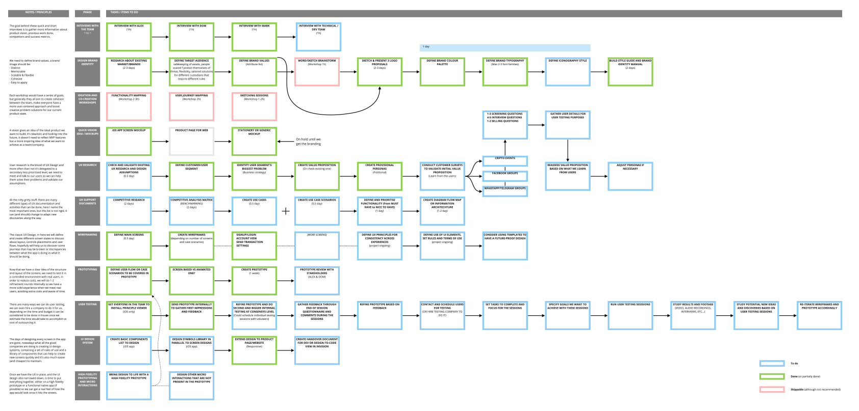
So the first task I decided to tackle was to come up with a detailed design plan that would guide us for the following months, this plan included from brand conceptualisation process to UX, wireframing and prototyping, oh, and even included bits about interior design as they requested if I could help them choosing office furniture and decorations too!
What did include
Brand design process, UX research, user and stakeholder meetings, wireframing and information architecture workshops, prototyping and revisions, visual desing, etc… everything was planned and reviewed with the company leaders and estimated accordingly, so I jumped right in!
This realistic and detailed plan touched all necessary points to bring a new brand image and product to life.
So, who are Trustology?
With the crypto currencies boom, people became more aware of the risks of holding on these new assets, and no solution so far offered a complete package that would substitute traditional custodian services and advanced banking posibilities.
The idea is to build a secure solution that would allow the creation of smart contracts through the app.
Using some concepts and words as starting point I sketched a few ideas and concepts that would help as a conversation started within the team and stakeholders in order to find the right idea.
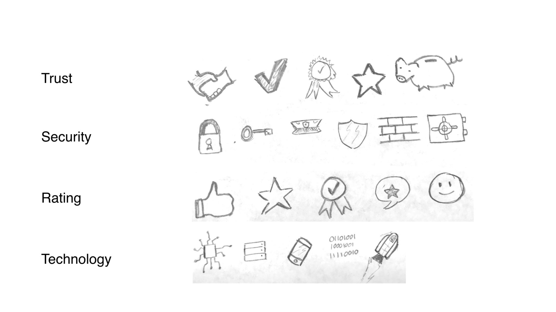
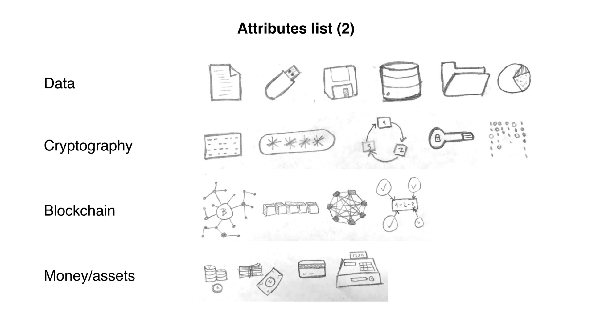
Brand attributes moodboard.
We defined a few brand attributes we would be happy to inspire the brand design process.
Trust, Security, Rating, Technology
Data, Cryptography, Blockchain, Money/Assets
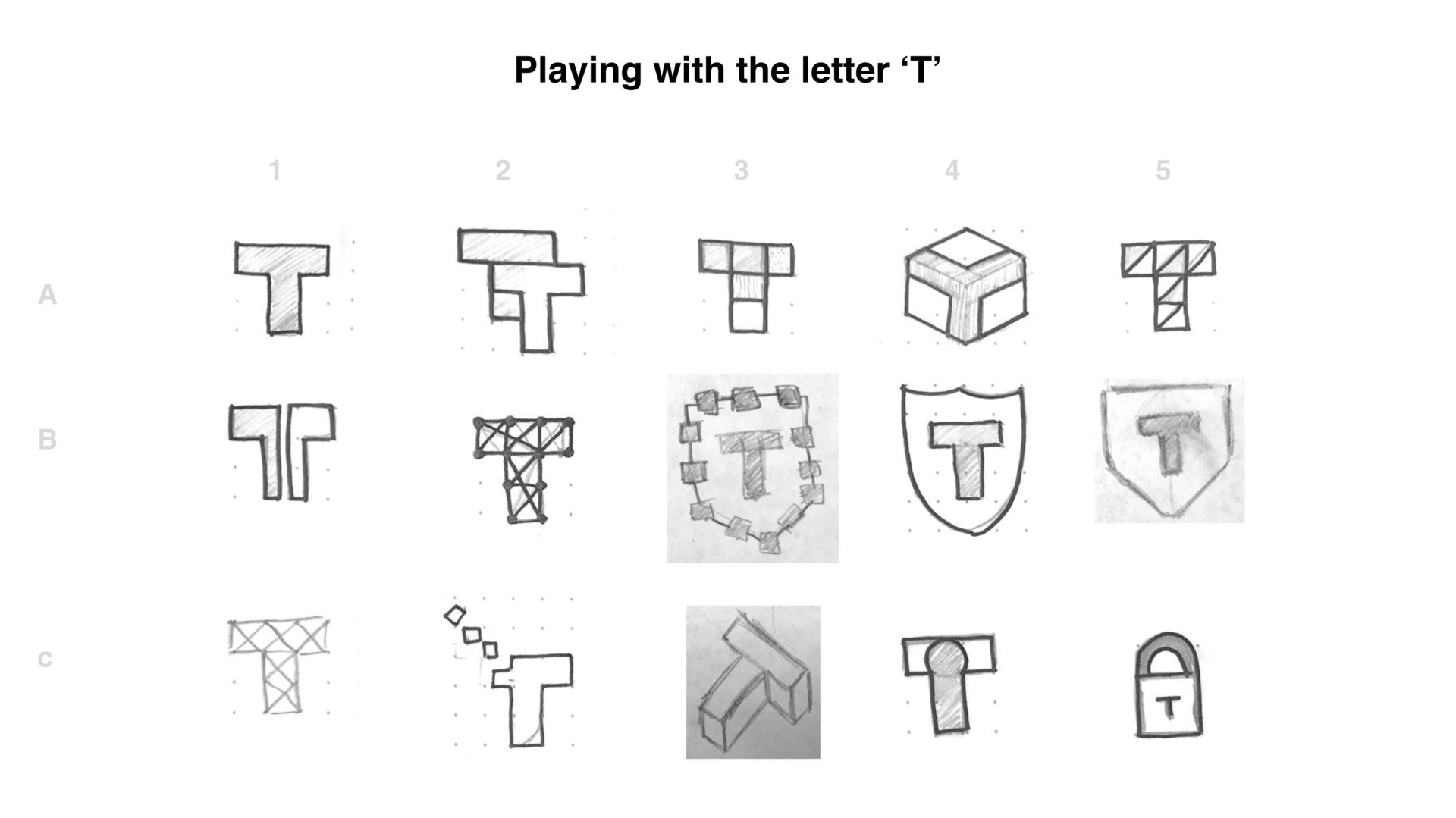
Exploring shapes and concepts.
From some of the previous sketches, I developed some ideas a bit further.
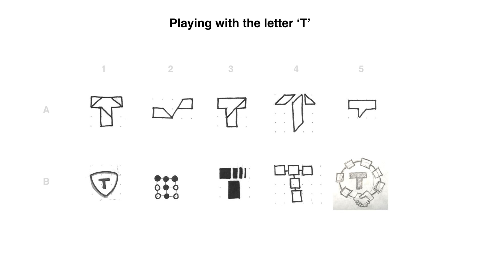
I also spent some time playing around with the letter ‘T’.
This sort of exercides are very useful when coming up with a new logo or brand.
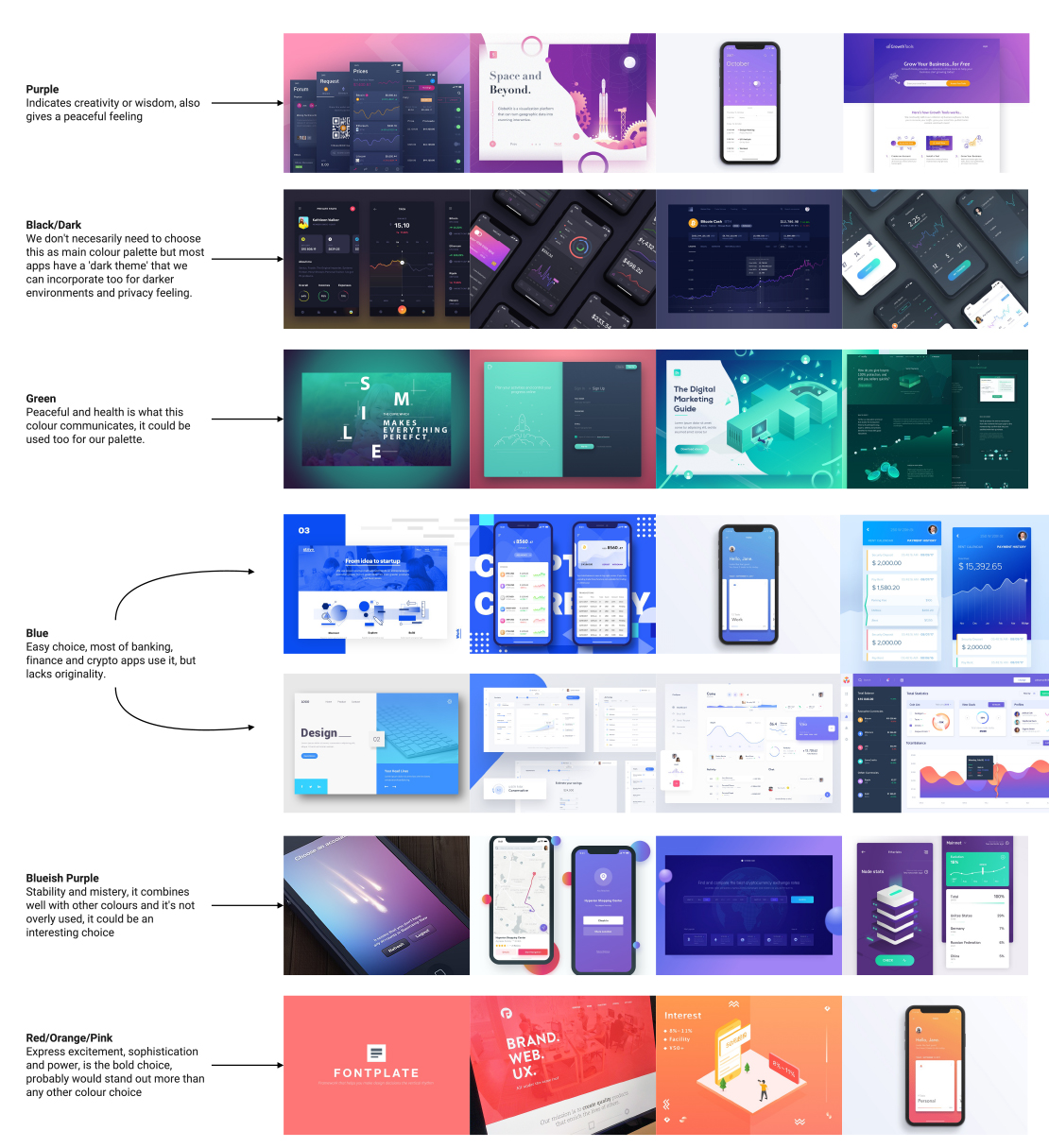
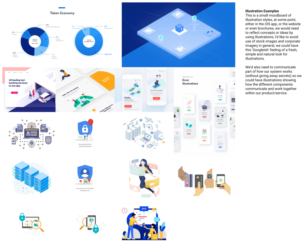
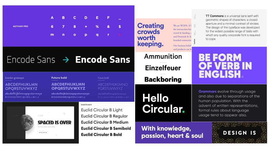
Moodboard sessions
Before designing the brand image, I had to learn as much as possible from the stakeholders in order to create a visual language that were in line with their vision.
After a few meetings and discussions around the moodboards and with new ideas, I started designing some concepts and try to come up with more polished solutions.
We played with different ideas, including the elliptic curve, the devil’s curve, the idea of nodes, some security-related concepts and so on.
The chosen one.
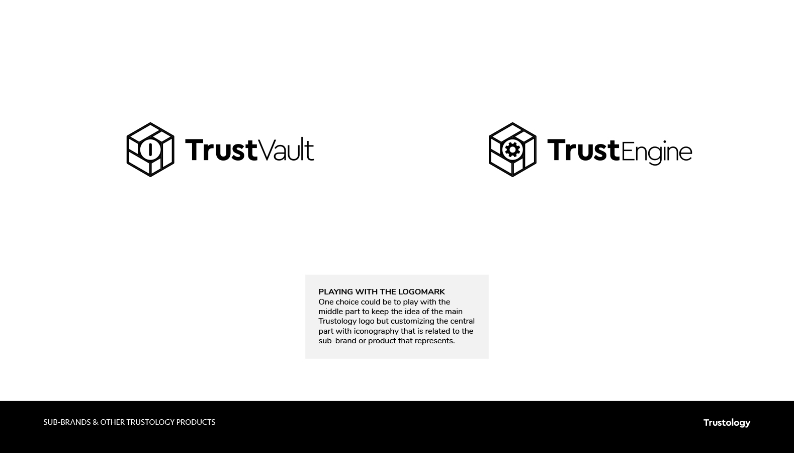
We ended up deciding to use the hexagonal version of the logo, it’s structure would allow us to be more playful and dynamic with the brand without constraining creativity.
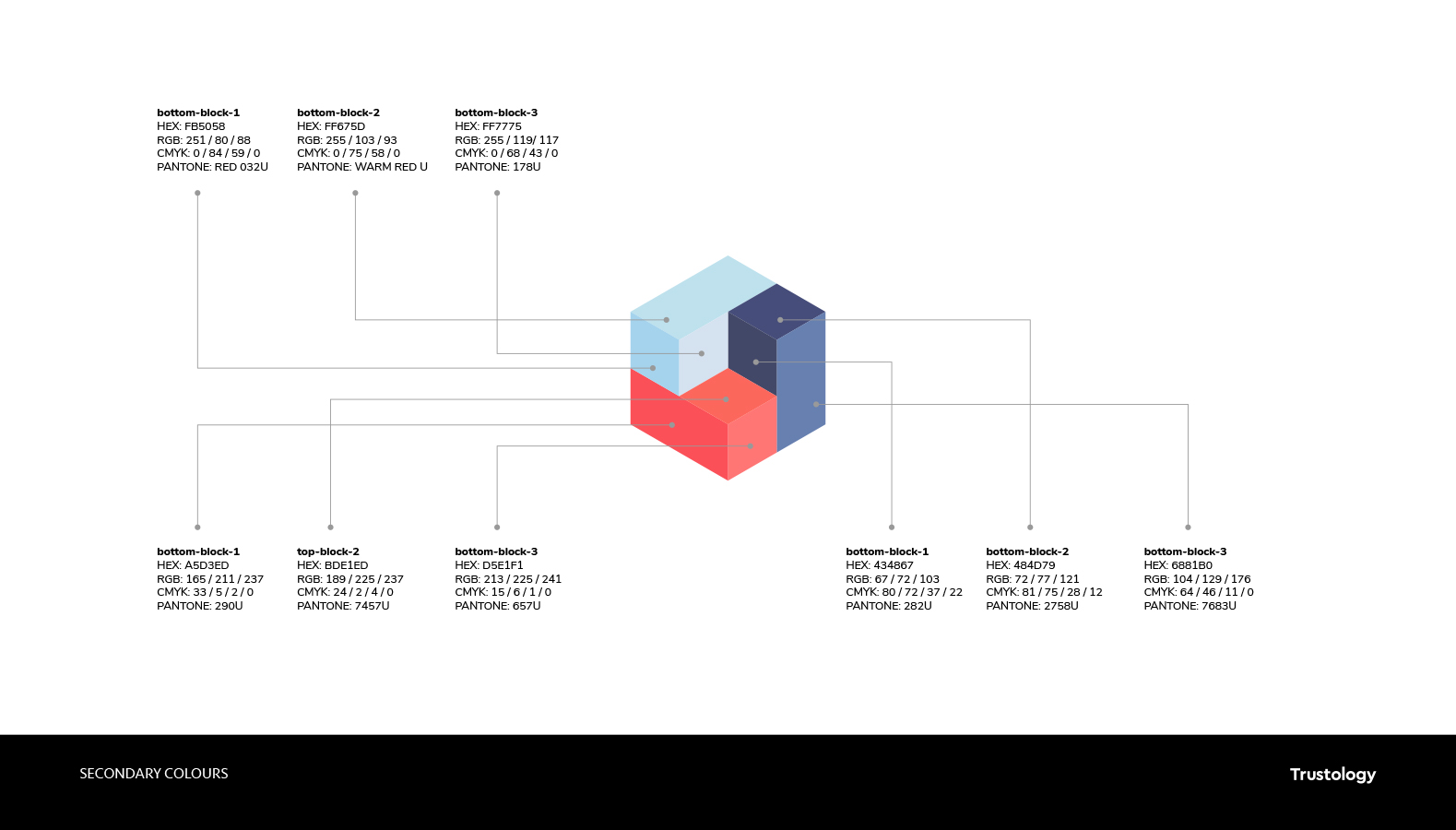
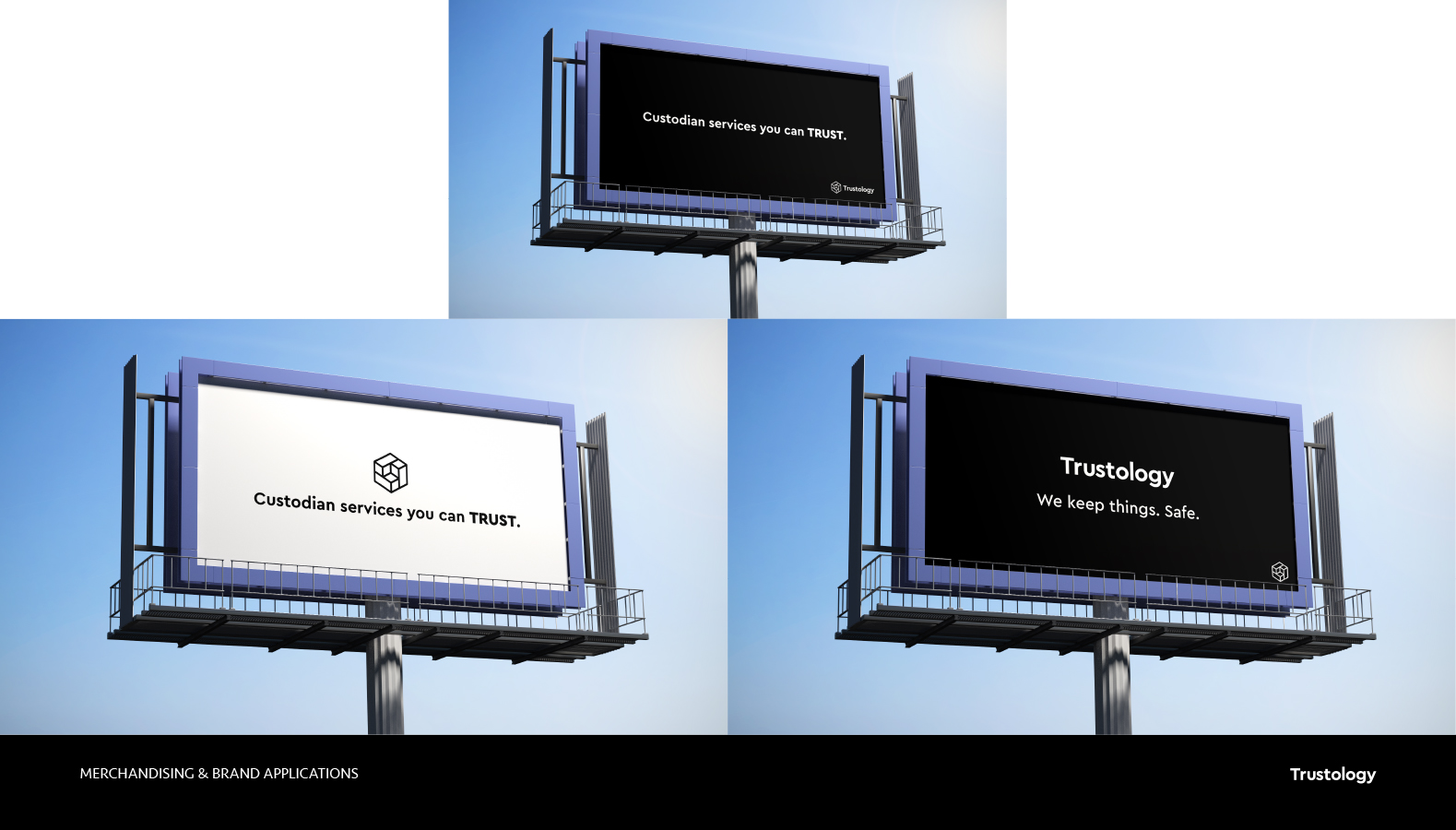
Extract from the brand identity manual.
I designed different options for the coloured and black and white versions of the logo.
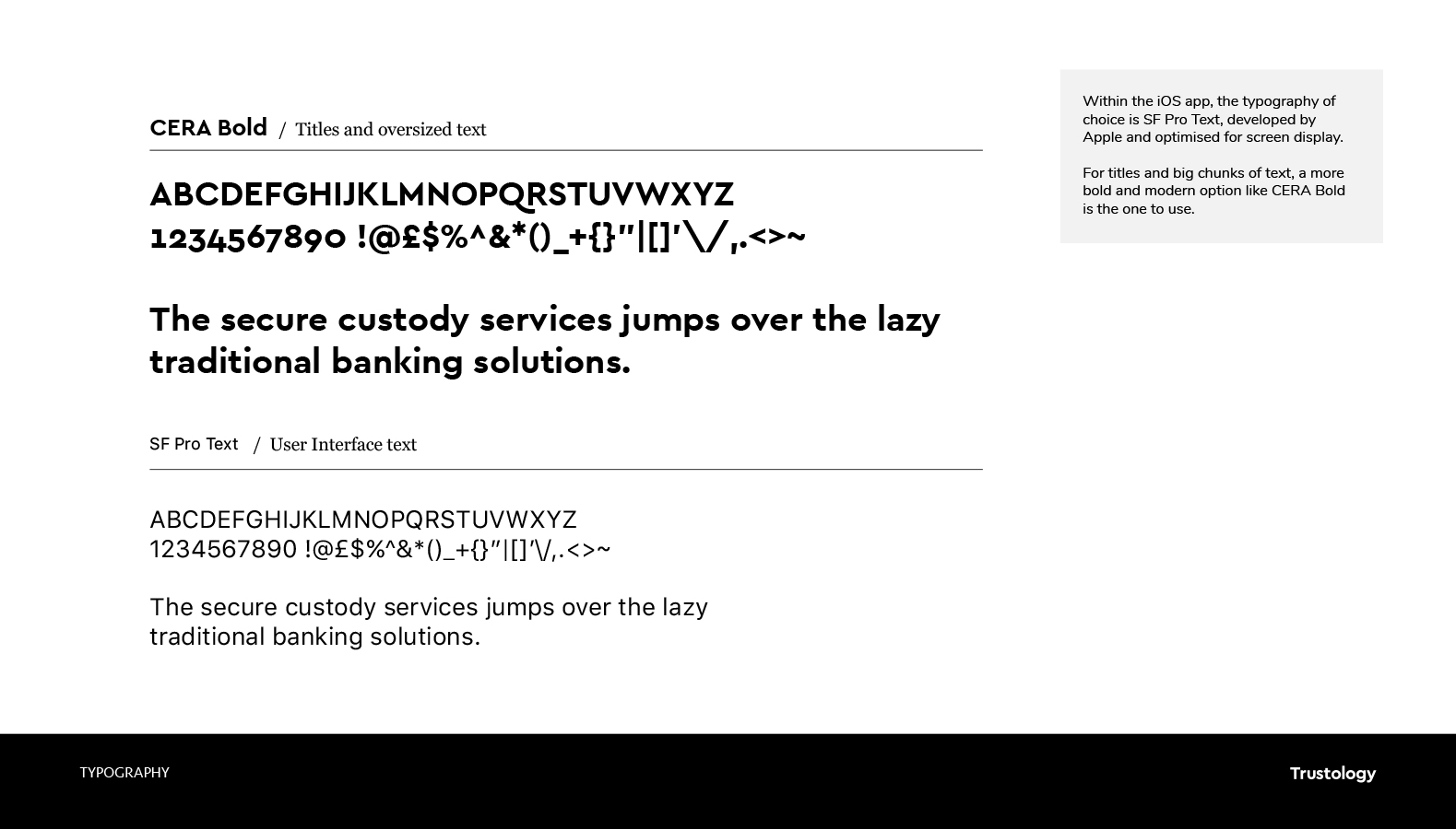
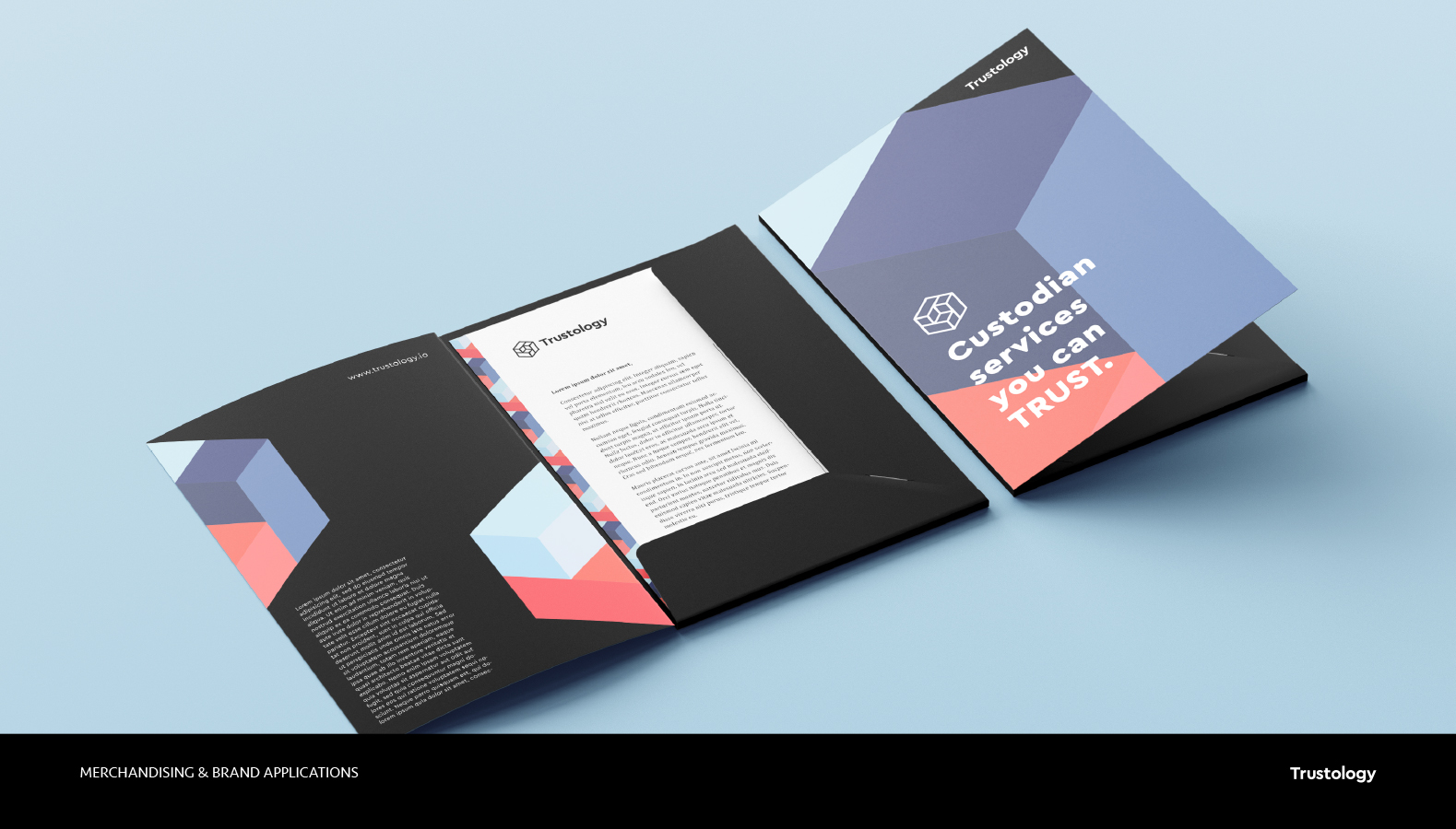
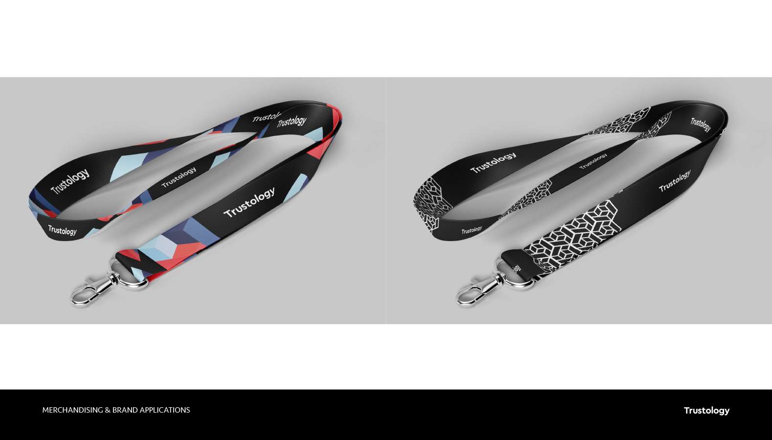
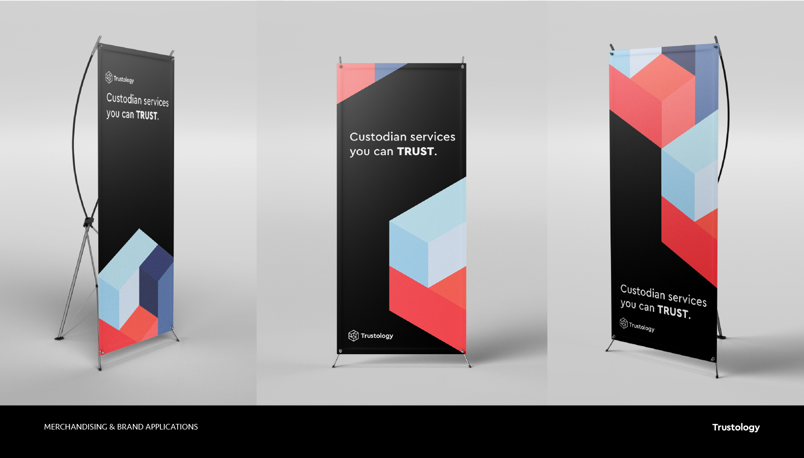
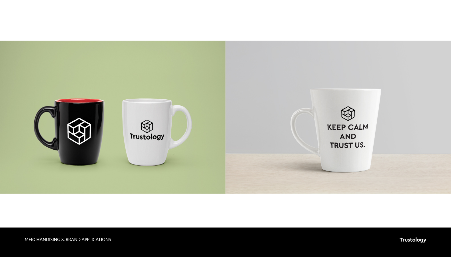
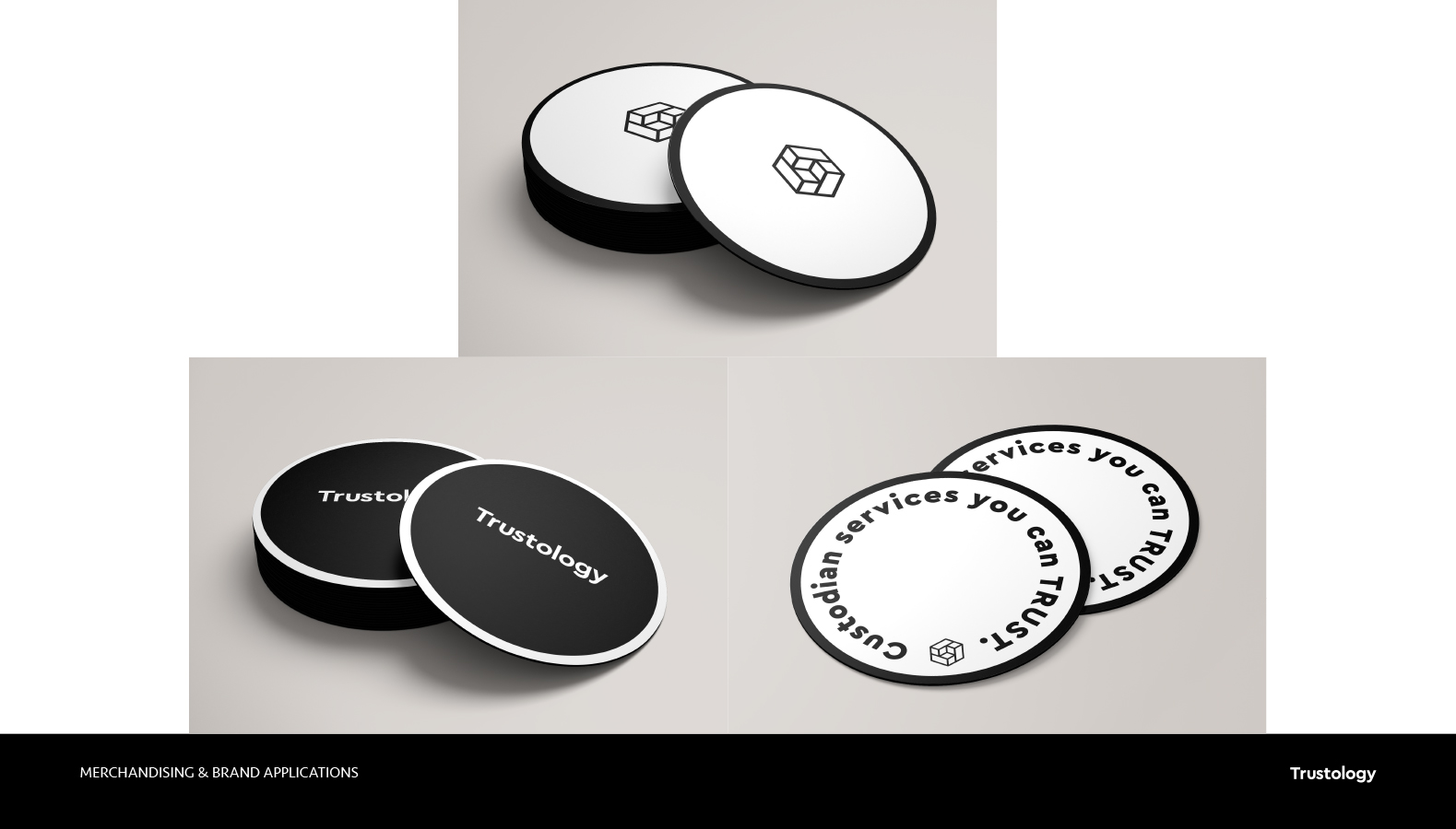
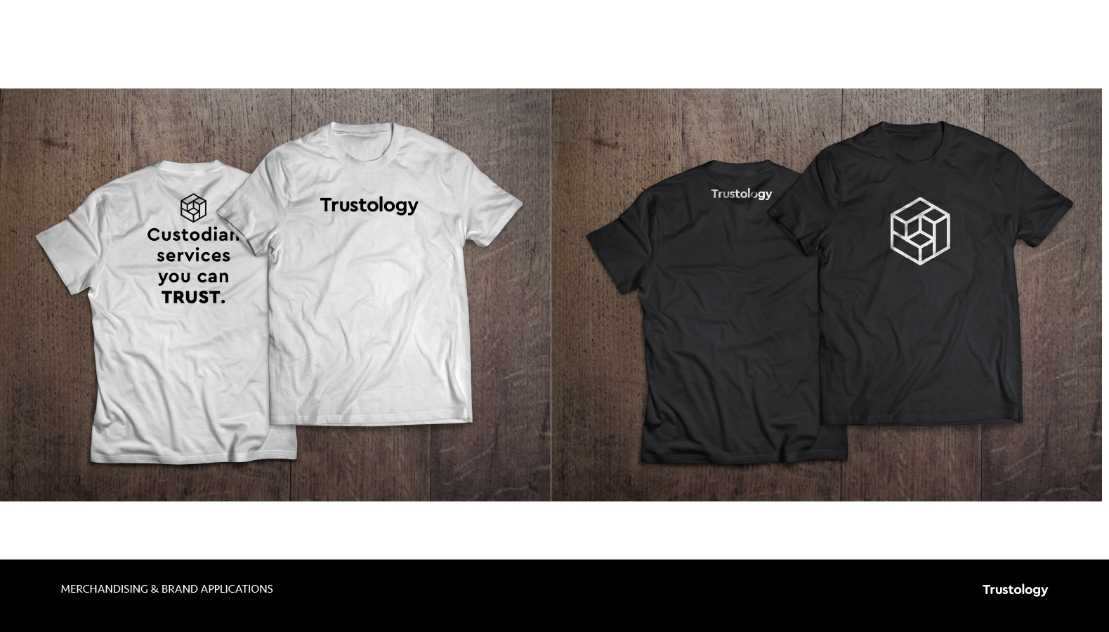
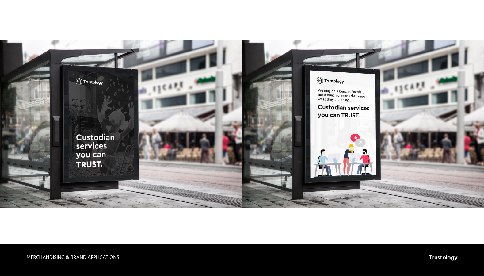
The manual includes also instructions for construction of the logotype, colour applications, dos & don’ts, typography use and stationery and merchandising designs.
User Experience design.
The main big piece of work of this project was to design in record time an iOS wallet and crypto custody app that we could start testing out internally thanks to the whole Consensys family.
I took the decision at this point to start creating a component library that was simple enough in order to quickly being used in the creation of wireframes and prototypes but with an element of style and design that would serve better the planning that the company have made for rolling out the first versions of the app.
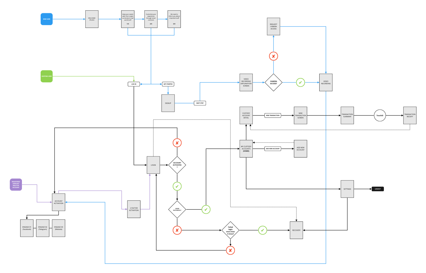
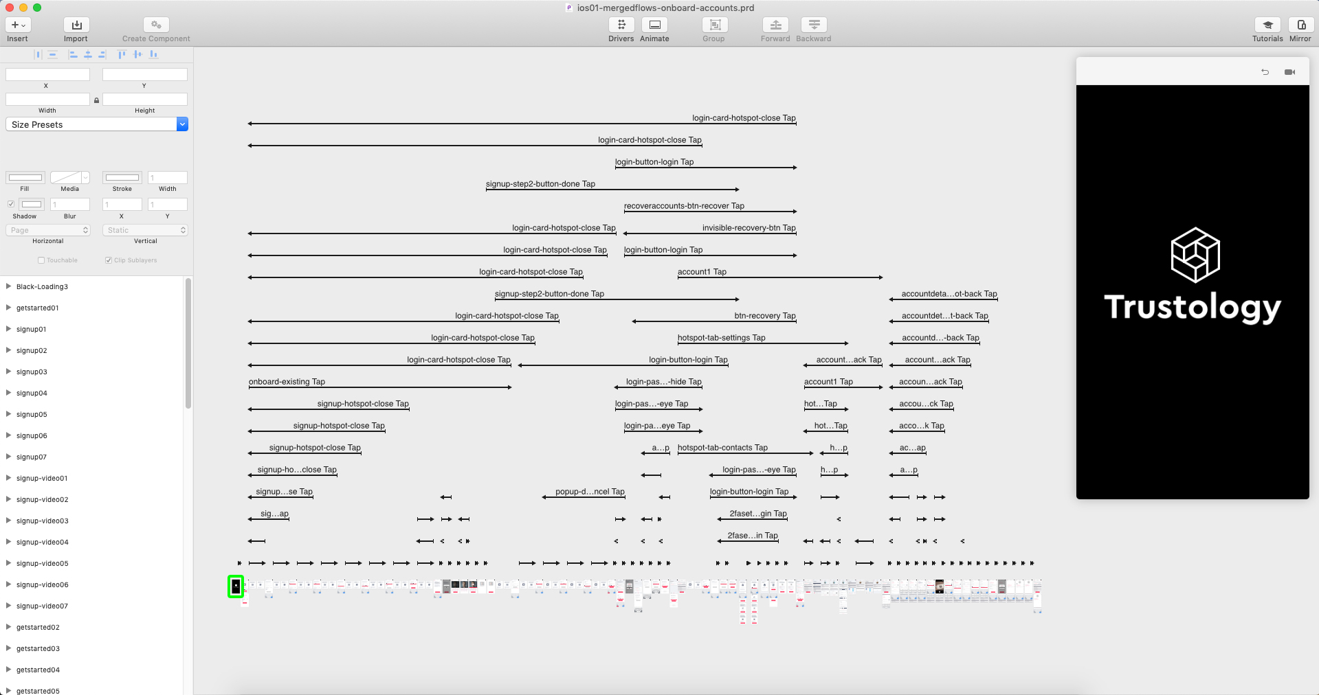
Onboarding user flow diagram.
The first user flow we started working on was the user onboarding experience.
This would include from login and registration, to activating 2-step verification, security procedures and creation of first custody accounts.
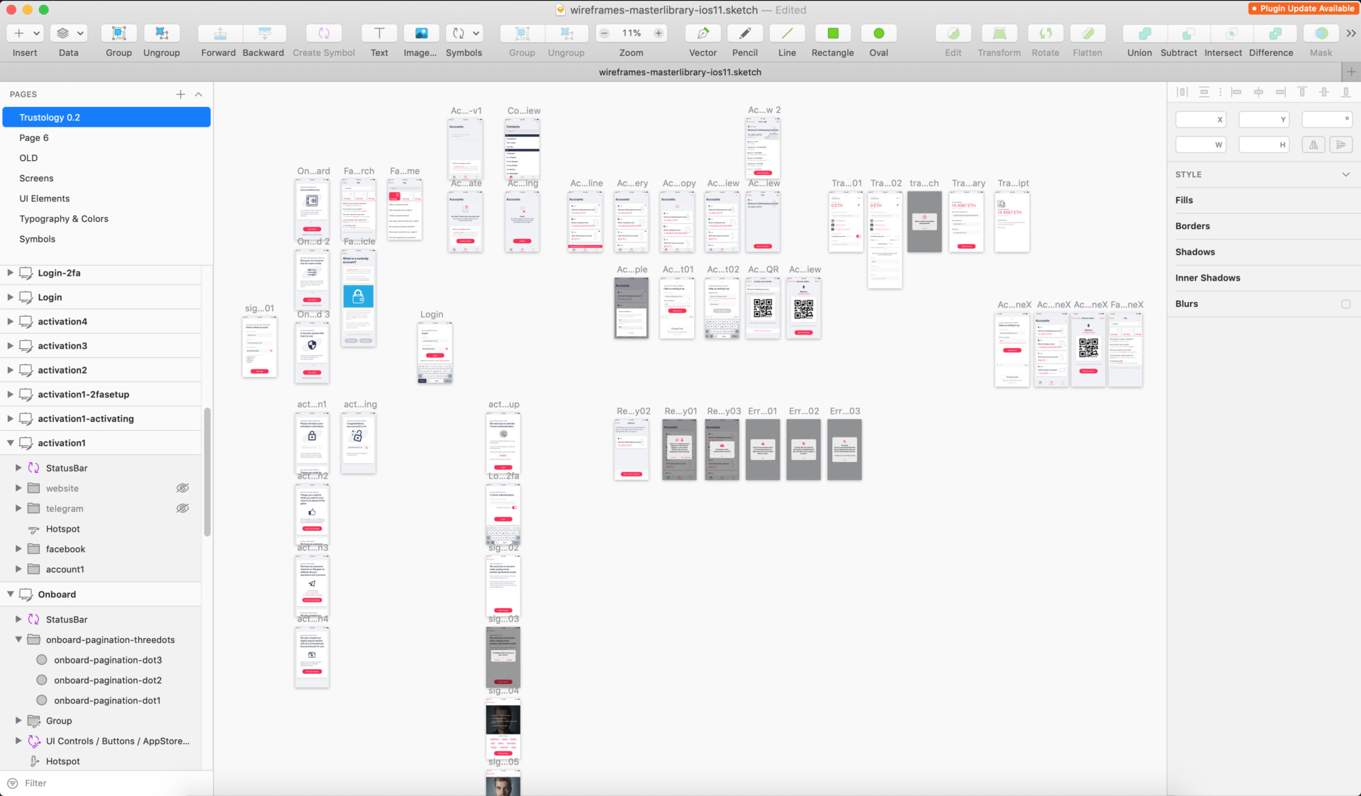
Wireframes with style.
Working in pararell as the development team in such early stage, I made a set of components that wouldn’t feel too wireframey so they could be potentially be used in the early versions of the app.
Using Sketch libraries was essential for this operation, so in further stages of the project we could simply revisit in a component-by-component basis and update the visual style easily.
Animating & prototyping
I have to admit, the best part of my job is to bring ideas to life with a prototyping tool, in this project I used Principle as allows me to quickly mockup ideas and ensemble together different files into one big prototype.
This allowed us to pitch and test ideas with clients and other colleagues, it was also super useful for the dev team as they would have the demo installed on their phone to play at their will.
Quick vision prototype
Onboarding + Signup
Security check
2 Factor Auth
Main accounts + Contacts
Balance display QR
Transfer flow: Cards
Transfer flow: Form
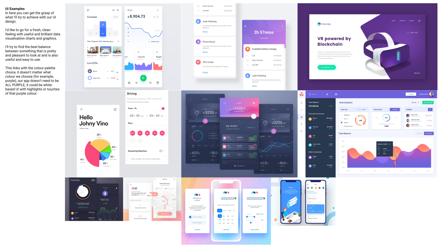
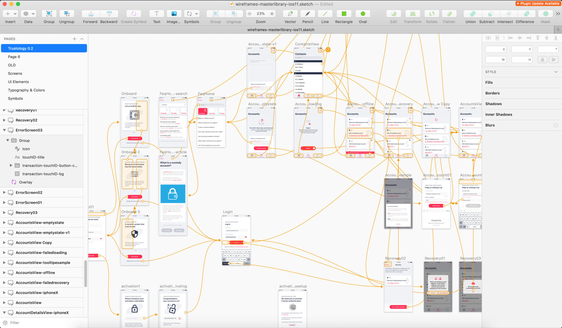
An eagle view of some of the files produced.
Here are some screenshots from a Sketch file used to prototype a clickable prototype and another file for a Principle project containing the high fidelity prototype and micro-interactions.
I always try to keep my files as tidy as possible and on Principle I’ve learned (the hard way) that the cleaner and perfectionist you are from the moment you create a new file, the better.