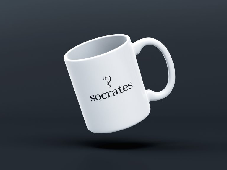
Socrates
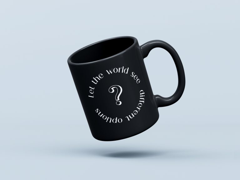
Let the world see different options.
My time in this project was very exciting, this startup have an exciting vision and its fast paced enviroment didn’t allow me a moment of boredom, I was lucky to have the CEO’s trust and I’m grateful for the opportunity I had to work with them.
- Trustology
- Branding, Design Systems, Prototyping
- www.socrates.com
Revolutionising the web3
When I was first contacted to join Socrates I wasn’t sure what the product was all about, but it quickly became clear that their intentions were to disrupt the whole web3 industry with a new concept of social media app that will change the rules of the game.
In today’s world where users’ data is the currency social media works and sustain their businesses, having a new competitor removing that price and replacing it with a reward and incentive system for users to actually make a profit out of their content, this was destined to have an impact.
So what is Socrates?
In essence, Socrates it’s a social media platform, but it changed the focus of who gets the benefit from users’ interaction from the company and third party advertisers to the users themselves and the community.
Bringing a high level of gamification and competition, it allows users to engage with one another creating content and earning rewards that would be cashable in real currency if desired.
Brand, internal processes, design systems and vision
Due to the nature of the role and the type of company, my responsibilities were many and varied, going from fundamental branding/vision areas to more advanced and structural parts such as creating collaboration and design processes for the design team to implement.
Also, being the most senior of our designers, I took on a mentoring role and helped the team shaping structures and creative workflows for internal delivery and collaboration that will ensure quality of work being delivered without having to complicate things or do unnecessary work.
For example, one of my initial tasks was to take their logotype, help refine it and make a professional brand identity guidelines document out of it since they didn’t have a proper one.
Challenge 1
Implement a design culture and collaboration processes
When I arrived to Socrates, the design team that was based in China and was very junior, they didn’t have a clear design collaboration process in place causing discrepancies between designs and adding extra difficulties to the delivery workflow.
The main issue what the lack of a professionaly developed design system and that’s where I come in, I audited their current design system which was scattered across different local files and didn’t have a centalised component library, most of the components didn’t have set up properly their properties and none of them were using variables of any kind.
Their product also had 2 main different platforms, one being mobile (iOS and Android) and the other one being a responsive web based platform.
From the get go, I could clearly see components that existed in those 2 platforms having completely different designs, duplicating the design maintenance and development work unnecessarily.
Collaboration flow
Having a process within a design team stating the collaboration delivery process can be really useful if not essential.
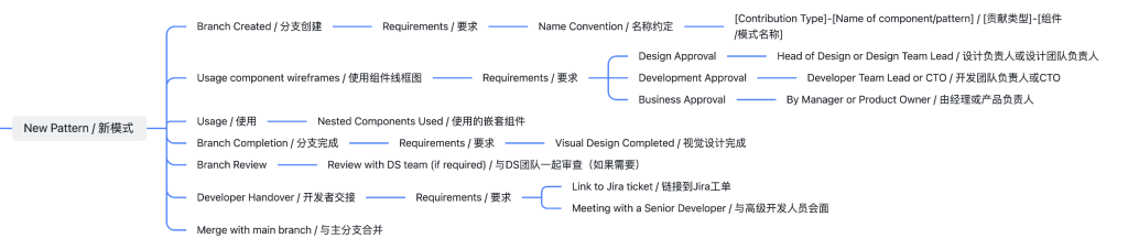
Starting from the central design system collaboration, I created a series of forms and documents detailing the design process, collaboration workflow, component/pattern submission process, etc.
Example: New pattern submission process
This mind map shows part of the document process for new interaction pattern submissions into the central design system.
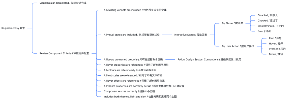
Example: New component criteria
This shows part of the submission process, specifically the criteria for new components to be included into the design system.
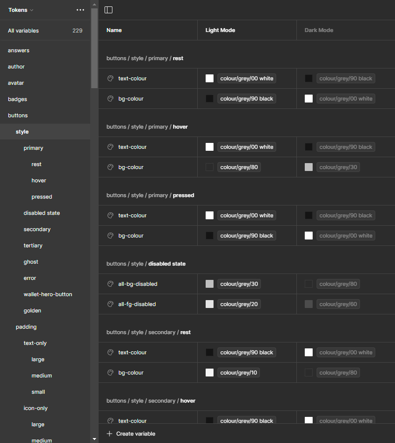
A token based design system to rule them all
After performing the UI & Component audit of their system, I started remaking all the components using a variables system that encompasses 2 main libraries.
All the colours used lived in a library called ‘primitives’ while all the components used a library called ‘tokens’.
The idea behind is that all token variables point to a primitive variable so there are no hardcoded colour/spacing values in the component library and these variables would be in line with the variables that the developers were using in their code.
The first obvious advantage is to have a clear 1 to 1 definition of variables that aligns design and development, the second advantage is the flexibility of the system when making changes and how much time is saved when refactoring.
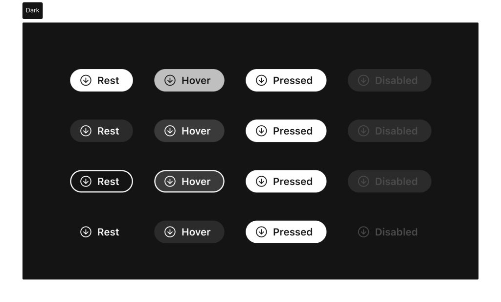
Themed components
The product was available in 2 themes, light and dark, but there were inconsistencies on how those themes were applied, thankfully the colour variabes proved useful to reduce these inconsistencies.
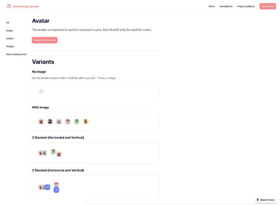
Here are some examples of some basic themed components. All components were optimised and had properties that allowed designers to easily include and customise them for different purposes.
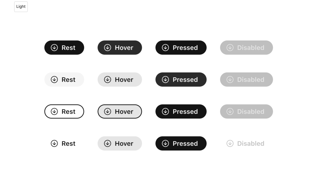
Example: Button component
Button components would include differente properties for better customisation:
- Style (Primary, secondary, tertiary, ghost)
- Type (Left icon, Right icon, Text only, Icon only)
- Size (Large, medium, small)
- State (Rest, hover, pressed, disabled)
- Icon instance (to replace icon from an icon library)
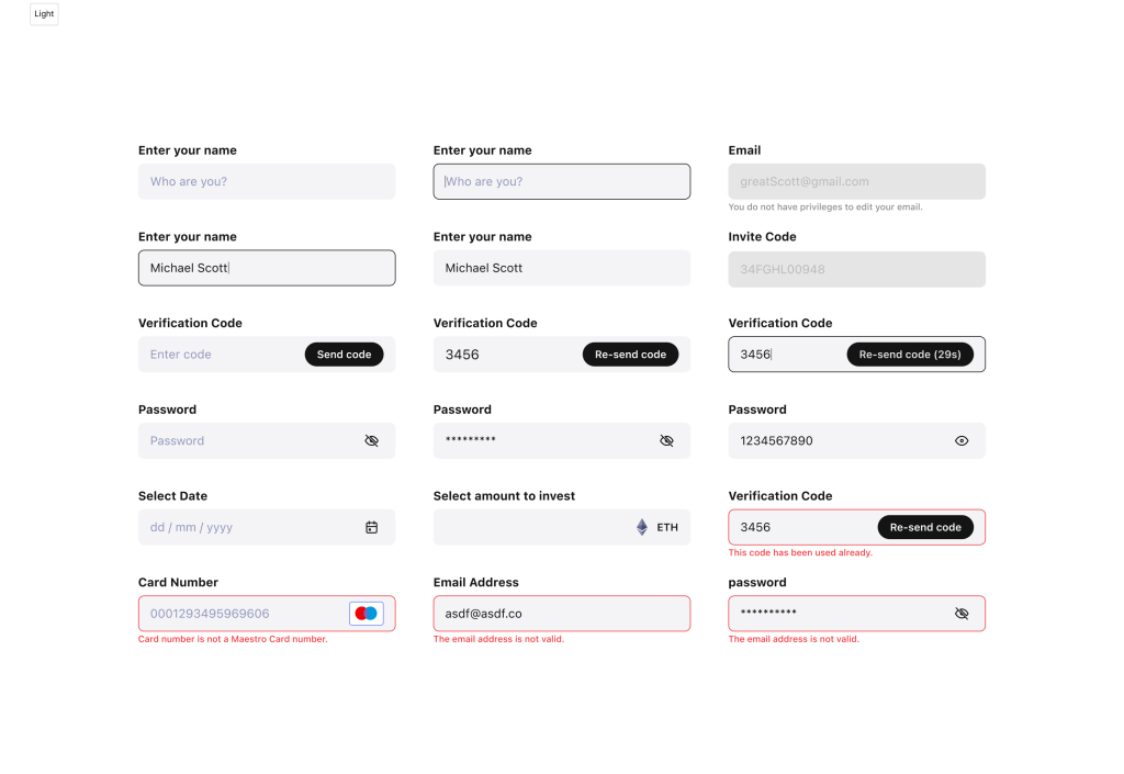
Example: Input component
Input components would include differente properties for better customisation:
- Platform (Mobile, web)
- State (Focus-filled, focus, filled, not filled)
- Disabled (On / Off)
- Has label (On / Off)
- Label text
- Filled content / Hint text
- Error/Hint? (Yes / No)
- Has action (Yes / No)
- Privacy icon (Yes / No)
- Currency icon (Yes / No)
- Payment (Yes / No)

The magic of variables
I’ve seen many teams not adopting a variable/token based approach for their design systems due to different reasons, from lack of time to simple not knowing how to properly implement them.
But the benefits are big and many so in my design approach when incorporating my design processes into a new project there’s no doubt that will be the solution to adopt.
I recorded this small clip to demonstrate my team how easy would be to create and edit themes when variables are implemented in the right way, the team quickly saw the benefits, sometimes you just have to show something in order to get people on board.
Challenge 2
UI design optimisation
As part of the UI design audit, my job focused on detecting areas that could be improved at component level and screen level, as well as optimising user flows.
One of the biggest issues I found was the amount of information on display at any given moment, there were many elements that could have been moved to secondary levels of interaction allowing the UI to breathe creating a more pleasant experience for the users.
I provided with suggestions of how to improve certain areas to the product and development team during my time at Socrates, at times creating prototypes and demos to demonstrate in a visual way the improved solution.
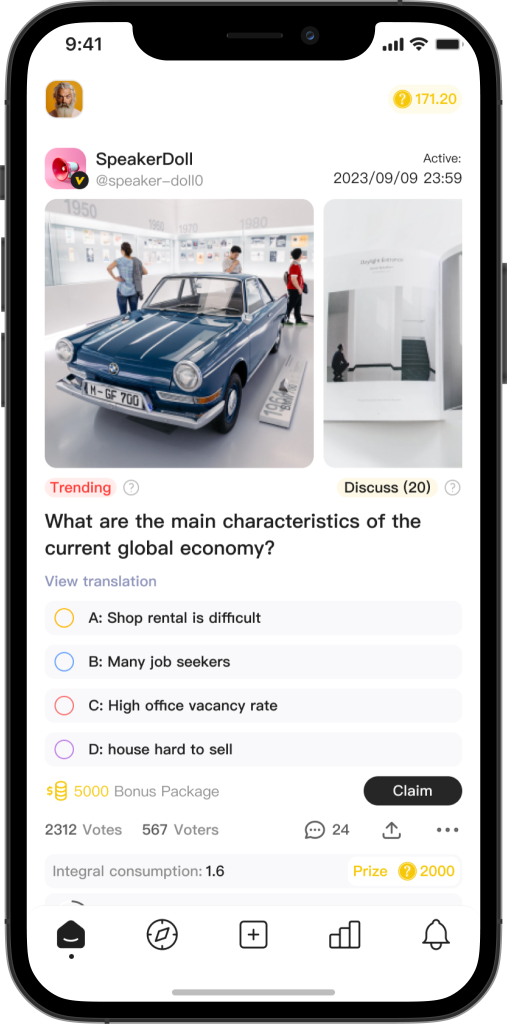
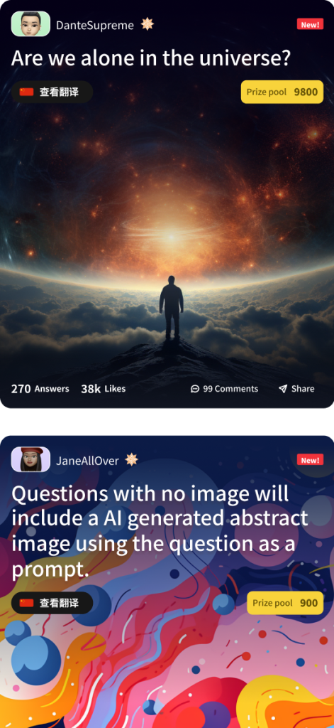
Old home
In the initial concept, questions were shown in the homepage with all the information at once.
This was suboptimal since not all users would be interested in answering all questions so there were unnecessary information for them beign displayed.
There were also a number of labels thatt seemed excessive, specially for those that are more commonly identifiable with an icon that is universally understood.
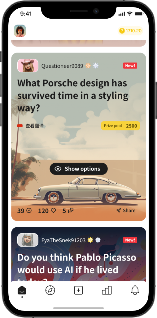
New home
Replacing the question component with cards, the information shown at any given time is limited to users and only when they are interesting in answering them they can interact with them and see the different options.
Progressive discoverability helps with reducing visual clutter and cognitive load when scanning information from a screen.
Labels were reduced to recognisable icons and images are given more protagonism.
Challenge 3
Vision and creativity
When I arrived to Socrates, many of the design solutions lacked a bit of that creative bliss or innovative UI design, so I embarqued in creating a series of design explorations and prototypes with ideas that I presented with success driving some of those solutions into development phase after stakeholders approval.
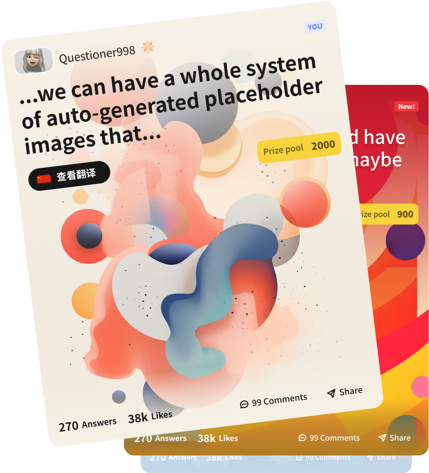
One of the solutions I created turned the question component into a image card based component, using native card interactions on mobile to increase engagement and make it more intuitive.
I envisioned a creative solution that would implement AI into the question creation process, allowing users to add AI generated images automatically generated based on a specific formula depending on the content of the question they were posting.
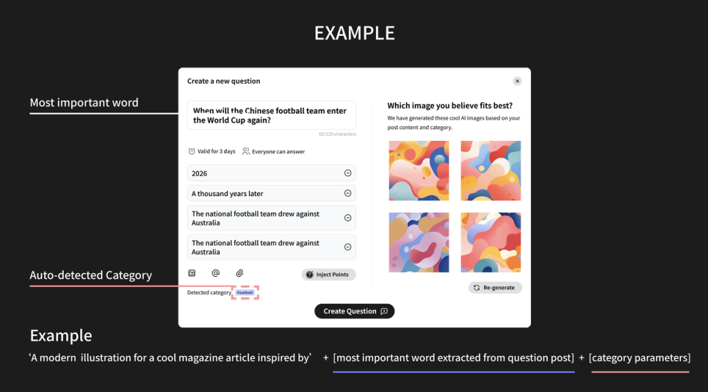
Creating questions new concept
I worked on a new concept vision for creating questions that would include AI generated images so users could easily attach a relevant image to their posts with no hassle.
The idea was to automate the generation of such AI image using a special formula based on certain parameters from the post content information.
The next image shows how that formula would work and how the system will ensure that every generated image would be displayed correctly.
How does it work?
The system will scan the user’s question to abstract the more relevant word from it, then based on the user’s selected category for their post, a series of parameters will be added in the prompt.
The final formula will include a predefined prompt base with those 2 variables added to it, generating an unique set of images based on the post content which the user can pick from, they can still upload their own image though, this functionality was just a plus.
This way we would be able to somehow generate cohesive and consistent in style images without the need for the user to know how to generate a proper AI prompt.
In the example above, the final prompt would be:
‘A modern illustration for a cool magazine article inspired by + world cup + dynamic, vibrant, active, sporty’
(Worldcup being the detected most relevant word of the question + the parameters for football category being: :dynamic, vibrant, active and sporty)
Below it’s explained how the system would work out the image colours to adjust the overlay gradient automatically and set the
Smart layered card adjustment
Below it’s explained how the system would work out the image colours to adjust the overlay gradient automatically and set the copy content to the proper colour scheme.
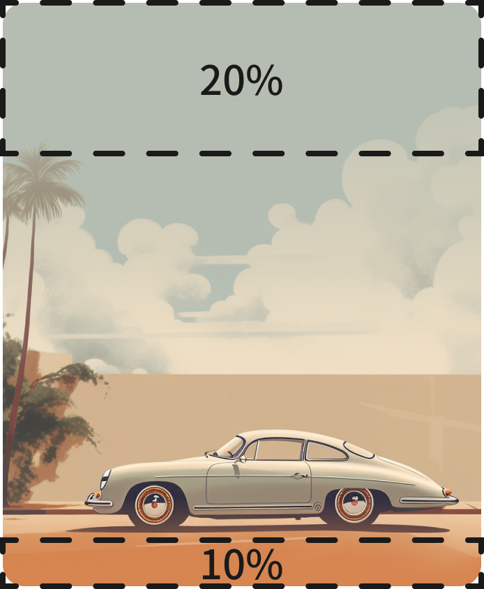
STEP 1
Smart back-end analyses the image colours.
Chooses the most common colour in the top 20% of the image.
Chooses the most common colour in the bottom 10% of the image.

STEP 2
Then creates an overlay gradient using the top and bottom most common colour as starting point and fading away towards the center of the card.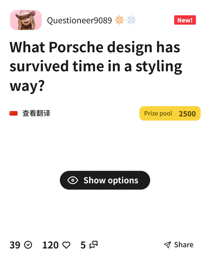
STEP 3
The system then adjusts the text-colour of the different elements depending on the level of brightness of the base gradient colour. If a base gradient colour is deemed to be light, then the text colour on top is set to dark mode.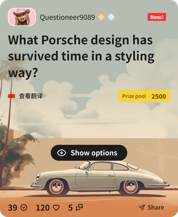
RESULT
End card will always have readable and visible text regardless of the image they have generated as background.New card, new interactions
Cards allow a whole new set of interactive solutions that are perfect for mix and match depending on each situation.
Interaction 1 – Scroll card stack
Cards are easily stackable and one of the most common ways is to do it in a vertical scroll container.
It’s such an easy interaction that most users would perform naturally that needs to be implemented first.
Interaction 2 – Card carousel
Another great way to interact with cards is on a carousel, swiping horizontally feels great on mobile devices and it’s also very intuitive as it’s mostly an standard at this point.
Interaction 3 – Card swipe stack
Ever since Tinder brought up this interaction to like people on their app, it has become another almost standard of how cards can be used in an effective an intuitive way.
Most users will automatically understand that if they want to see the card below because the one shown is not of their interest, all they have to do is swipe left/right to make it disappear.
New card types prototypes
With the addition of the new designs for the questions and with the planning to include other types of media content such as videos and multiple images per post, I created this quick prototype using Principle to demonstrate the different interactions that can be performed.
From opening a card to see the comments and options, to navigate through the different images on a carousel question, and see how the different elements would play together when combined.
New card types prototype
In order to get the team on board of this new concept, nothing better than a prototype showing the idea in use and demonstrating how the product can be improved with a few design changes.
This prototype is quite long ( 2min) as it goes through 3 different new type of card media content: single image, multiple images and video.
It also demonstrates a vital part of this new card paradigm, how to expand a question in order to read the comments and interact with others.
Small incremental changes
As part of this product optimisation, we decided not to radically change the questions components but to add the cards as a new way to interact with new concept and ideas we were looking to incporporate to the product.
This prototype shows how the cards would be included in the current homepage to allow users to interact with them in a diffeerent way.
It also shows new sections like debates and battles that had a completely different interaction and were more fast paced.
This demo’s purpose was also to test the bottom sub navigation tabs which we were considering moving from the top of the screen due to reachability concerns.
Create question flow
Another of the vision prototypes I worked in was about creating new questions for the platform and how to make it more engaging and fun.
This approach shows a modular component that takes the user through all the different information blocks to add before publishing with a preview of their post at the end.
Challenge 4
Lack of brand cohesion and identity
Having a logo is not enough, brand identity goes further than that, it’s about conveying a language your customers understand, it’s about creating an identity that is recognisable without the need of using words.
Some of the concepts I created to help achieving this level of consistency and identity are related to different merch and stationery that would be created to help spread the brand awareness and get user’s attention in different environments.
I also redesigned their official website to something more modern as the previous one they had was not up to curent trends.
The basics.
With the creation of any manual of brand identity there are always some basic foudnations that can’t be skipped.
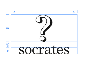
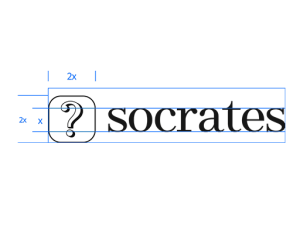
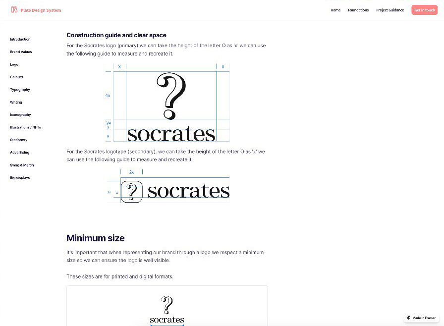
I defined the uses of the logotype in its different layouts like primary, secondary and tertiary layouts.
I also defined the colour themes we will be adhering to, primary and secondary.
I also created guides for logo construction, minimum sizes and wrong uses, all these components are commonly seen in any brand guideline document but were non-existent in Socrates creating a disparity of layouts and inconsistencies across different channels.
The non visual.
Brand identity goes beyond a visual language, it’s not about logos and colour themes exclusively but also about communication and tone of voice.
How does your brand communicate with its audience?
Is it friendly or formal? Polite or bold? Does it use hashtags? Does it use abbreviations? How does it write dates and numbers?
The more granularly you define your brand, the more cohesive the output, the more consistent the message and ths stronger the foundation your communications will lay on.
I helped them defining all this along with the different principles that would guide any brand communication.
Design guidelines and foundations website
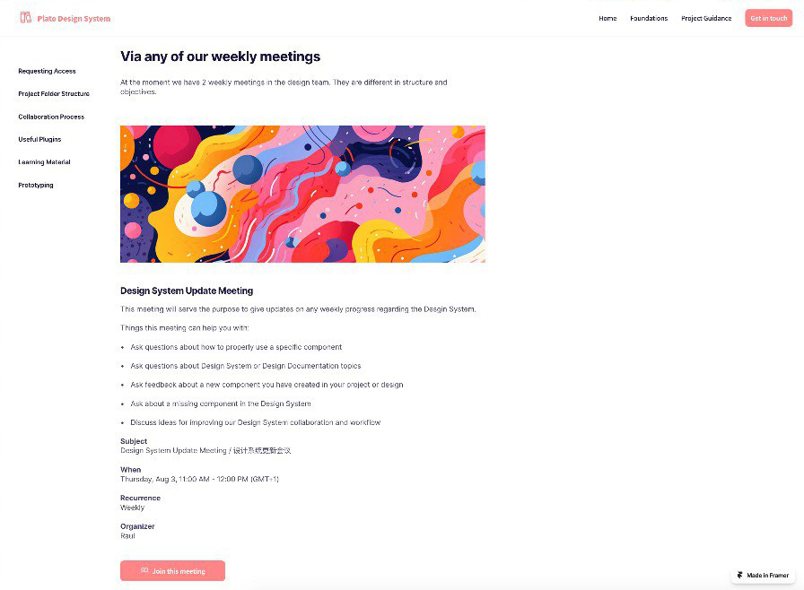
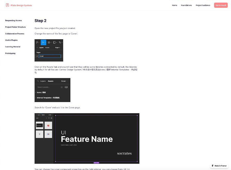
As part of helping the team adopt a design culture and increase collaboration, I created a whole site that included different parts, from design foundational concepts to specific brand guidelines, as well as project setup guidance in Figma, meetings, etc.
It was a very throrough platform and decided to call it Plato Design System, since Plato was Socrates’ pupil and responsible of keeping Socrates’ teachings that we can access nowadays.
Stationery & swag designs.
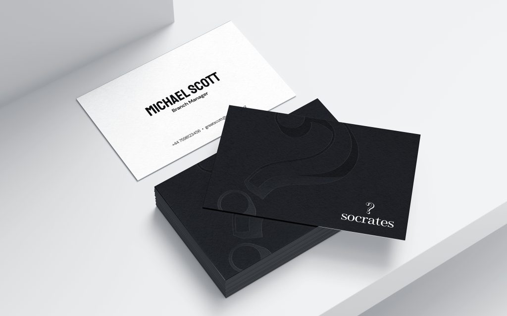
As a very early stage startup, they didn’t have any proper stationery design and were using very basic business cards that were not really doing any diferential work.
I helped them designing some material that would take their brand style into a new level.
Business cards.
Simple but effective card design using 200gsm stock card with UV treatment to show the ? logo reflection.
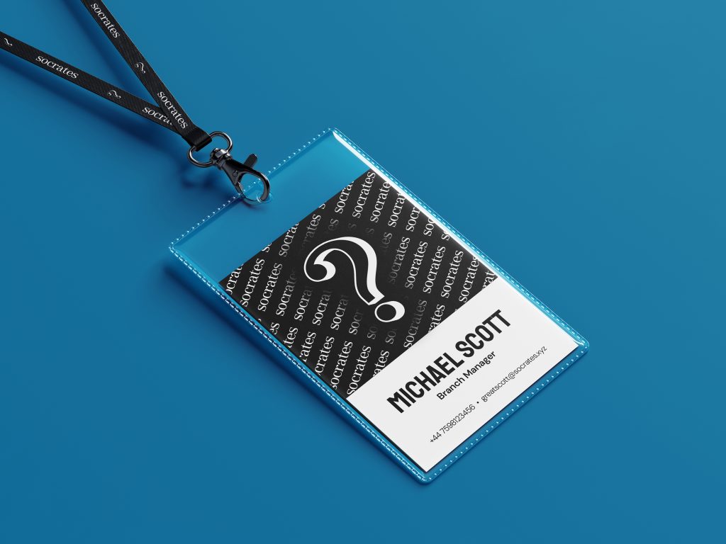
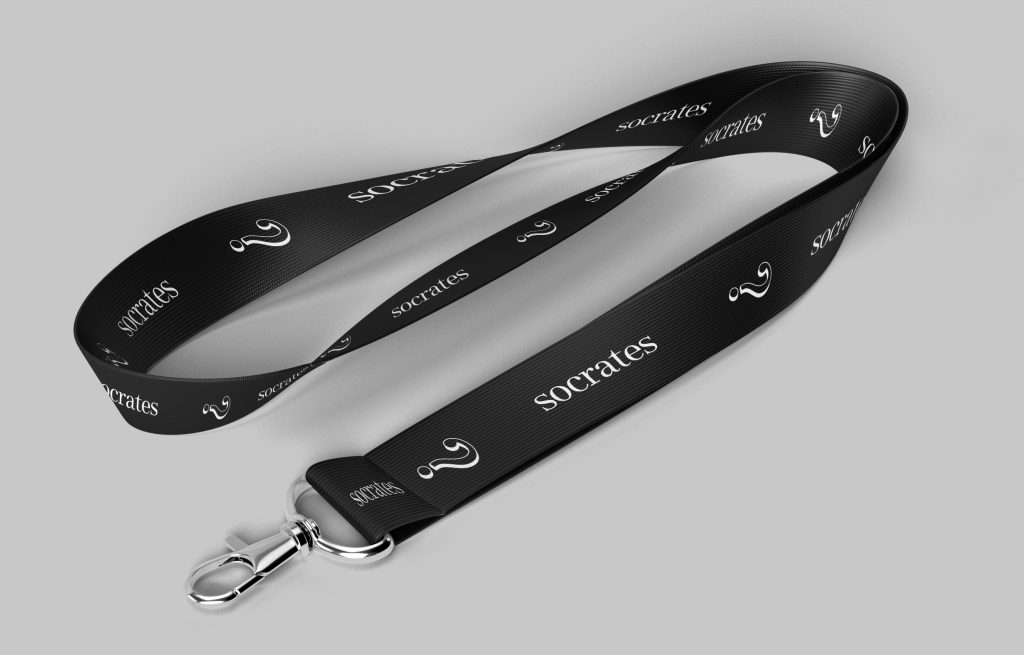
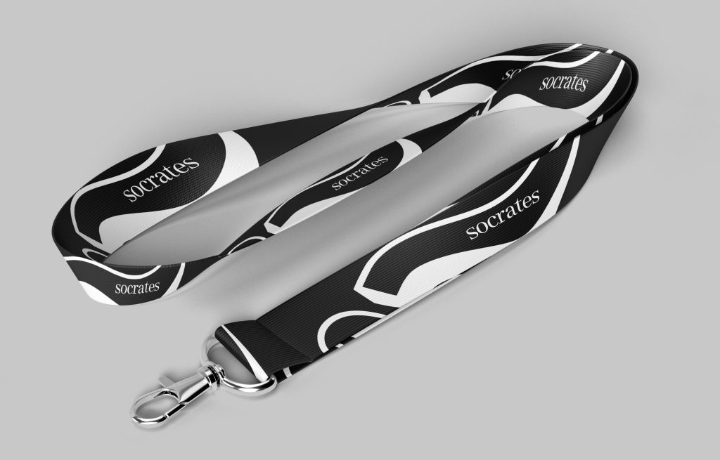
Event nametags and lanyards.
For a company that wants to create a sense of community and get involved in events in the web3 industry, having proper brand material for this purpose is very necessary.
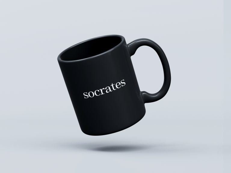
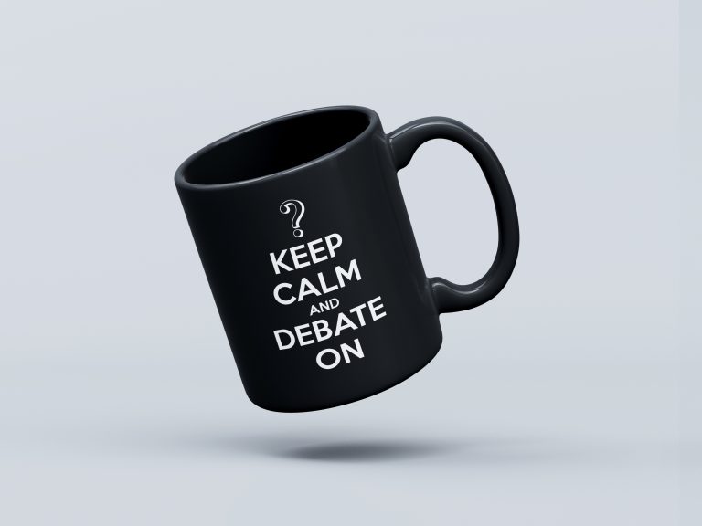
Mugs.
Mugs are perfect to stamp a brand on as they are items of every day use, they can have multiple colours and have that physical aspect of it that makes people want to have one, is that simple.
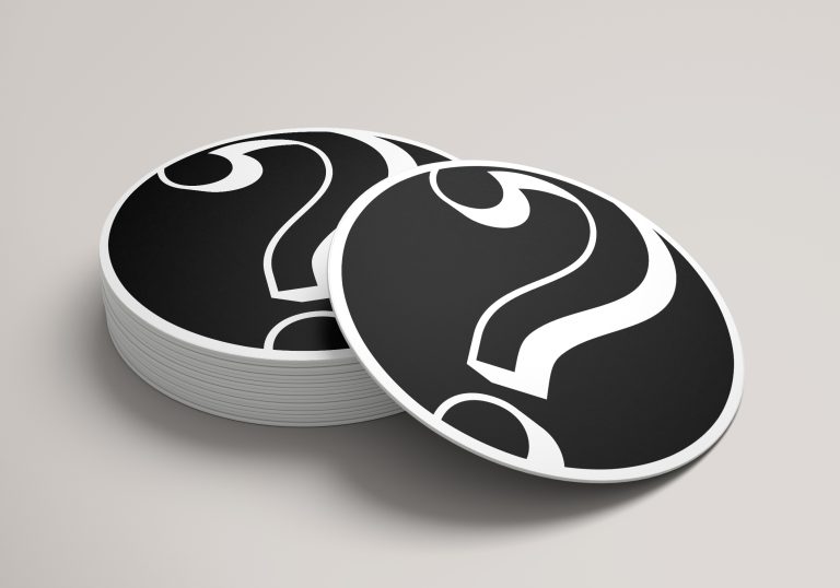
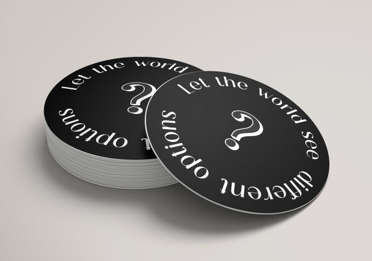
No mugs without coasters.
Some coasters to place that cool mug you just got.

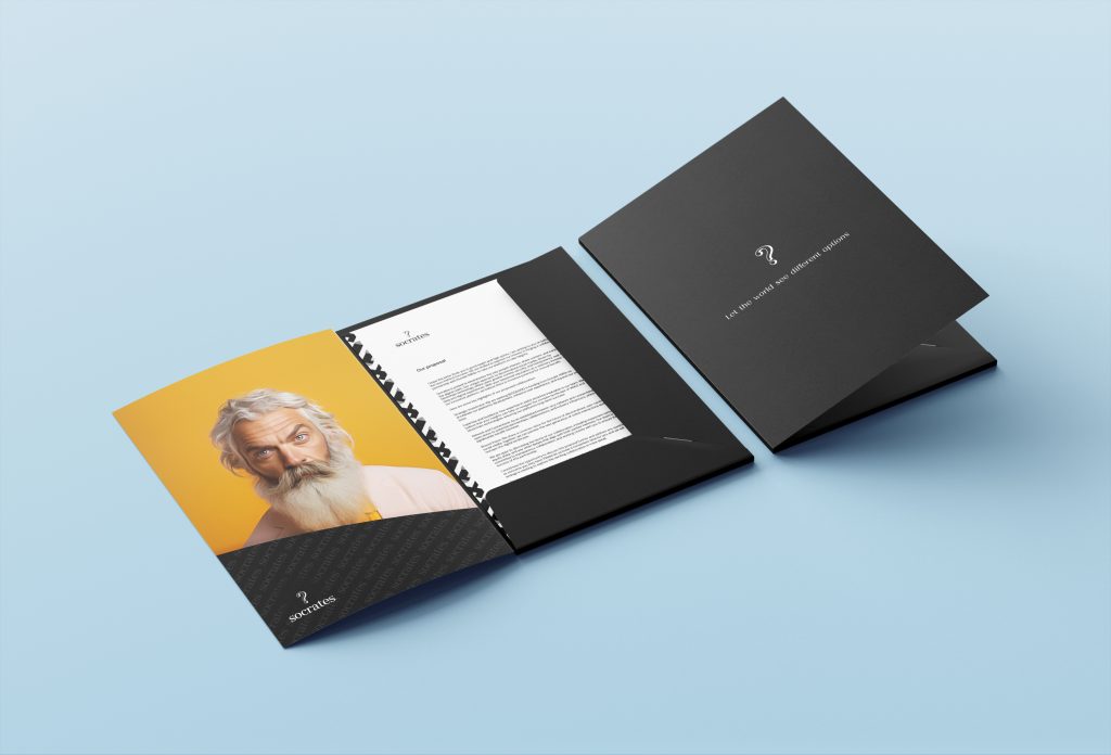
Document folder.
I designed a document folder and letters for brand communication.
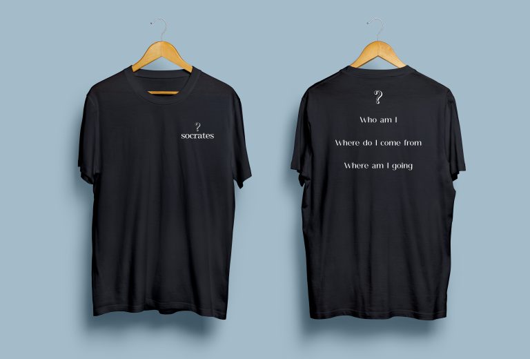
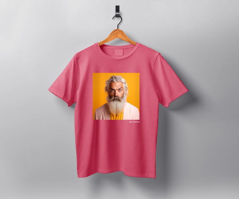
T Shirt designs.
T-shirts is usually the first merchandising item every company designs but not all get right, do more than just stamping the logo on it and call it a day, be creative and bold, people will want to wear them at all times!
This first one features our primary logo in the front and the famous Socrates sentences in the back along with our question mark symbol.
The idea of this one is that people looking at your back will not know what the t-shirt is about but will probably trigger their curiosity.
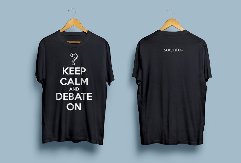
In the second one is where we start having some fun, remember the famous poster the UK government created prior to World War II back in 1939?
You’ve seen this template replicated nowadays in all sort of formats, since in Socrates we going to a digital war, it was a perfect yet fun concept to explore, and we have a very visual symbol to crown the top of it, it all fits too well!
The brand colours being very black and white I wanted to also add some colour when necessary, since they are a modern and fun company, so that needs to be reflected as well in their brand.
Use of a bold colour is encouraged because if done well, can reinforce our brand image without compromising the basic colour scheme.
This t-shirt uses a bold pink colour that contrasts very well with what has slowly become a more human-like representation of Socrates, an AI image of Socrates himself with a modern-nowadays look and feel.
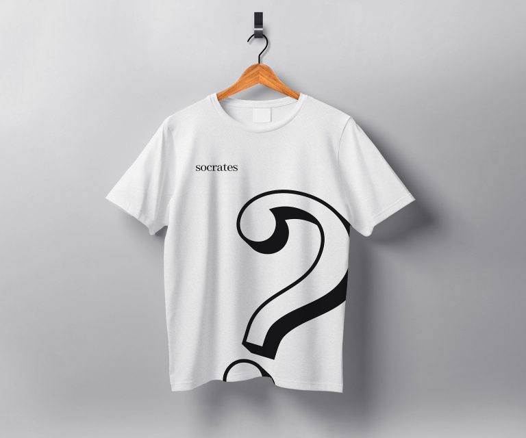
The white version has a only front design but it’s very bold as it has a supersized question mark symbol and our secondary logo version in the chest right side.
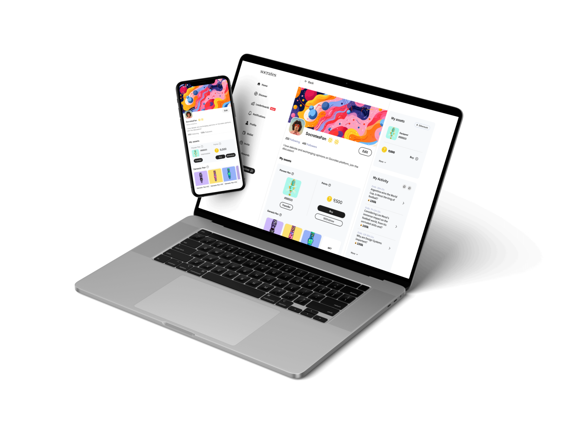
Website design and wallet connect
Apart from redesigning their website from scratch I also worked on how to connect users’ wallets into the website in order to mint an NFT.
Web3 comes with some challenges, specially around user’s acquisition and the technological barrier for those users that aren’t so tech savvy.
Website can be visited here: www.socrates.com
Connecting your wallet in web3
To understand the ins and outs of how connecting your wallet into a website lies the ability to make that experience as easy as possible.
Working closely with the tech teaqm is vital to understand this and I helped Socrates creating the website page that will help users mint their own NFT Pen while connecting their own crypto wallet into it.
Thanks for your time!
Honestly, if you are still reading this I appreciate you taking the time on learning about my time at Socrates.
I’ve left many things out but I wanted to share as much as I could of my process and the amount of work I did for them.
It was a crazy ride from start to end, startups can be like that but I really appreciate the opportunity and trust their stakeholders put on me and the amazing colleagues I met along the way, hope we cross paths again in the future.